W04 Genetic Structure
W04 Genetic Structure
Session Presenters


Required packages
As always we need to have dartRverse installed and loaded. In addition you need to have dartR.popgen installed.
# install.packages("leaflet.minicharts")
# install.packages("iterpc")
library(dartRverse)
W04 Genetic Structure
Workflow
In this tutorial you will learn about genetic structure analyses. We will go over several analytical techniques with one example dataset and you will complete one exercise afterwards. Here you will learn differences between the analytical techniques and how to identify bias in your data.
- Introduction
- Example with possum data
- PCA
- STRUCTURE
- faststructure
- sNMF
- PopCluster
- Exercises
- Exercise 1: Your own data
- Exercise 2: Biased kin sampling
- Exercise 3: Structural variants bias
- Exercise 4: Uneven sampling design
- References
Why genetic structure matters
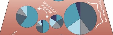
What is a “population” from a genetic perspective?
Genetic structure defined – how allele frequencies vary among groups.
Key drivers: effective population size, gene flow/immigration, natural selection, drift.
Isolation-by-distance & sampling design – avoiding spurious structure.
Why we care: management units, inbreeding, local adaptation, introgression.
Analytical toolkit
| Approach | Purpose | dartR entry point |
| PCoA / PCA | Quick multivariate overview | gl.pcoa(), gl.pcoa.plot() |
| STRUCTURE | Bayesian clustering | gl.run.structure(), gl.plot.structure(), gl.map.structure(),gl.read.structure() |
| fastSTRUCTURE | Fast variational STRUCTURE (Mac/Linux) | gl.run.faststructure(), gl.plot.faststructure() |
| sNMF | Sparse non-negative matrix factorisation | gl.run.snmf(), gl.plot.snmf(), gl.map.snmf() |
| POPCLUSTER | Ultra-fast admixture inference | gl.run.popcluster(), gl.plot.popcluster(), gl.map.popcluster() |
Example
To help us understand our analytical toolkit better let’s start with a simple example using a simulated dataset.
The dataset contains 10 sampling locations of 30 individuals each and 1000 loci and is part of the dartRverse package.
To get an overview of the dataset, we use the function: gl.map.interactive which plots the individuals on a map. Please note the genlight/dartR object needs to have valid lat long coordinates for each individual to be able to do so.
table(pop(possums.gl)) #check the individuals and the sampling locations
 A  B  C  D  E  F  G  H  I  J
30 30 30 30 30 30 30 30 30 30
map <- gl.map.interactive(possums.gl)Starting gl.map.interactive
Processing genlight object with SNP data
Completed: gl.map.interactive map# htmlwidgets::saveWidget(widget = map, file = "possum_map.html") ##to saveThe sampling locations are fairly independent but are linked by some immigration, so a typical Meta-population scenario. The sampling locations are named A to J and follow more or less an isolation by distance. So sampling locations next to each other (e.g. B and C) are fairly well mixed and sampling locations further apart from the rest (e.g. D) are more isolated.
PCA
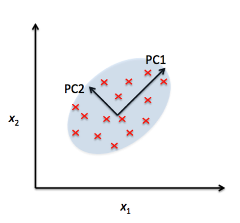
Principal Component Analysis (PCA) is a powerful statistical technique used for dimensionality reduction, data visualization, and feature extraction. In many real-world datasets, like our SNP datasets, data can have a very high number of features or dimensions. PCA helps by transforming the data into a new coordinate system where most of the variability in the data can be captured in fewer dimensions.
At its core, PCA identifies the directions (called principal components) along which the variation in the data is highest. These directions are orthogonal (perpendicular) to each other and are ranked by how much variance they capture from the original data. By projecting data onto the top few principal components, we can often retain the most important information while discarding noise or less useful details.
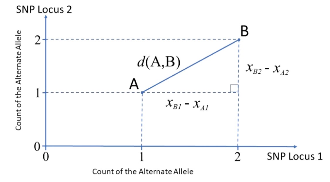
Great paper on PCA: Distances and their visualization in studies of spatial-temporal genetic variation using single nucleotide polymorphisms (SNPs)
# Undertake a PCA on the raw data
pc <- gl.pcoa(possums.gl, verbose = 3)
Starting gl.pcoa
Processing genlight object with SNP data
Warning: Number of loci is less than the number of individuals to be represented
Performing a PCA, individuals as entities, loci as attributes, SNP genotype as stateFound more than one class "dist" in cache; using the first, from namespace 'BiocGenerics'Also defined by 'spam'Found more than one class "dist" in cache; using the first, from namespace 'BiocGenerics'Also defined by 'spam'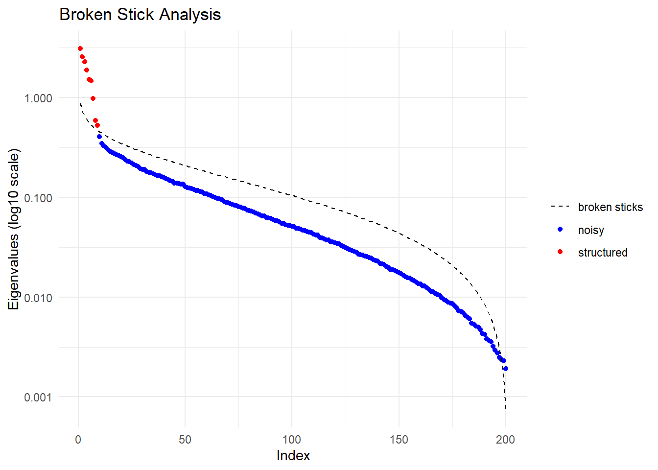
  Ordination yielded 9 informative dimensions( broken-stick criterion) from 299 original dimensions
    PCA Axis 1 explains 10.5 % of the total variance
    PCA Axis 1 and 2 combined explain 19.1 % of the total variance
    PCA Axis 1-3 combined explain 26.8 % of the total variance
Starting gl.colors
Selected color type 2
Completed: gl.colors 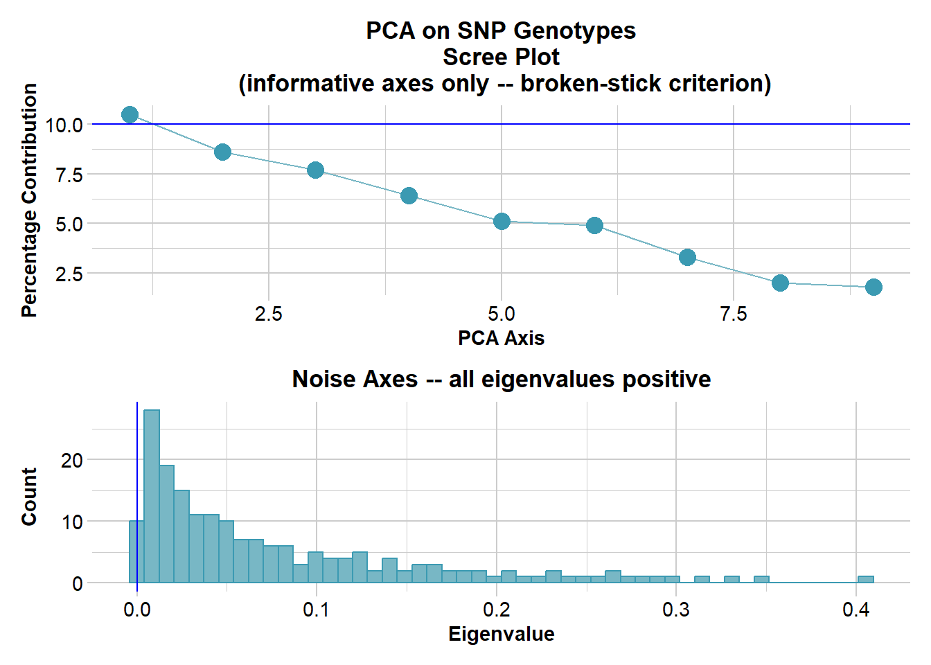
Completed: gl.pcoa # Plot the first two dimensions of the PCA
pc_a1a2 <- gl.pcoa.plot(glPca = pc, x = possums.gl)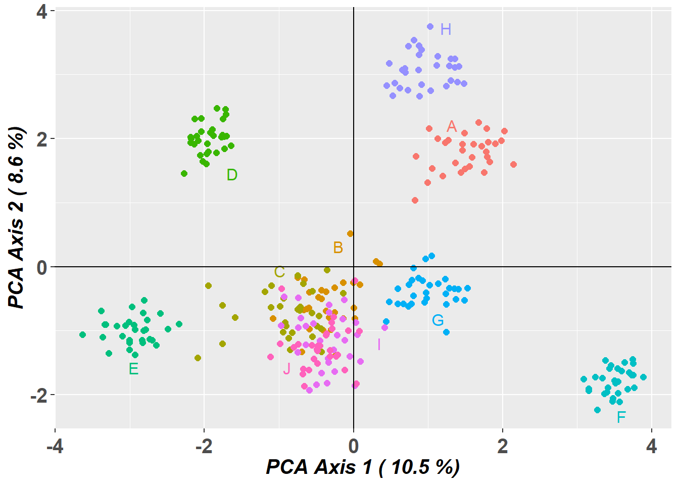
# Plot the first and third dimensions of the PCA
pc_a1a3 <- gl.pcoa.plot(glPca = pc, x = possums.gl, xaxis = 1, yaxis = 3)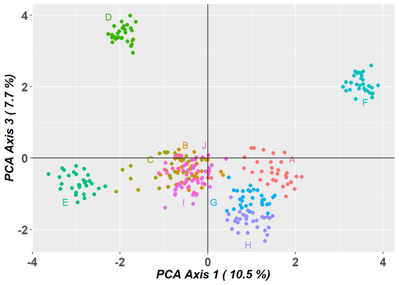
# Plot the first three dimensions of the PCA
pc_a1a3 <- gl.pcoa.plot(glPca = pc, x = possums.gl, xaxis = 1, yaxis = 2, zaxis = 3)
Warning in RColorBrewer::brewer.pal(N, "Set2"): n too large, allowed maximum for palette Set2 is 8
Returning the palette you asked for with that many colors
Warning in RColorBrewer::brewer.pal(N, "Set2"): n too large, allowed maximum for palette Set2 is 8
Returning the palette you asked for with that many colorsSelect one cluster
# Select only the data from one cluster in the primary PCA
temp <- gl.drop.pop(x = possums.gl, pop.list = c('D', 'A', 'E', 'F', 'H'))
Starting gl.drop.pop
Processing genlight object with SNP data
Checking for presence of nominated populations, deleting them
Warning: Resultant dataset may contain monomorphic loci
Locus metrics not recalculated
Completed: gl.drop.pop # Plot the first two dimensions of the secondary PCA
pc <- gl.pcoa(temp, verbose = 3)Starting gl.pcoa
Processing genlight object with SNP data
Performing a PCA, individuals as entities, loci as attributes, SNP genotype as state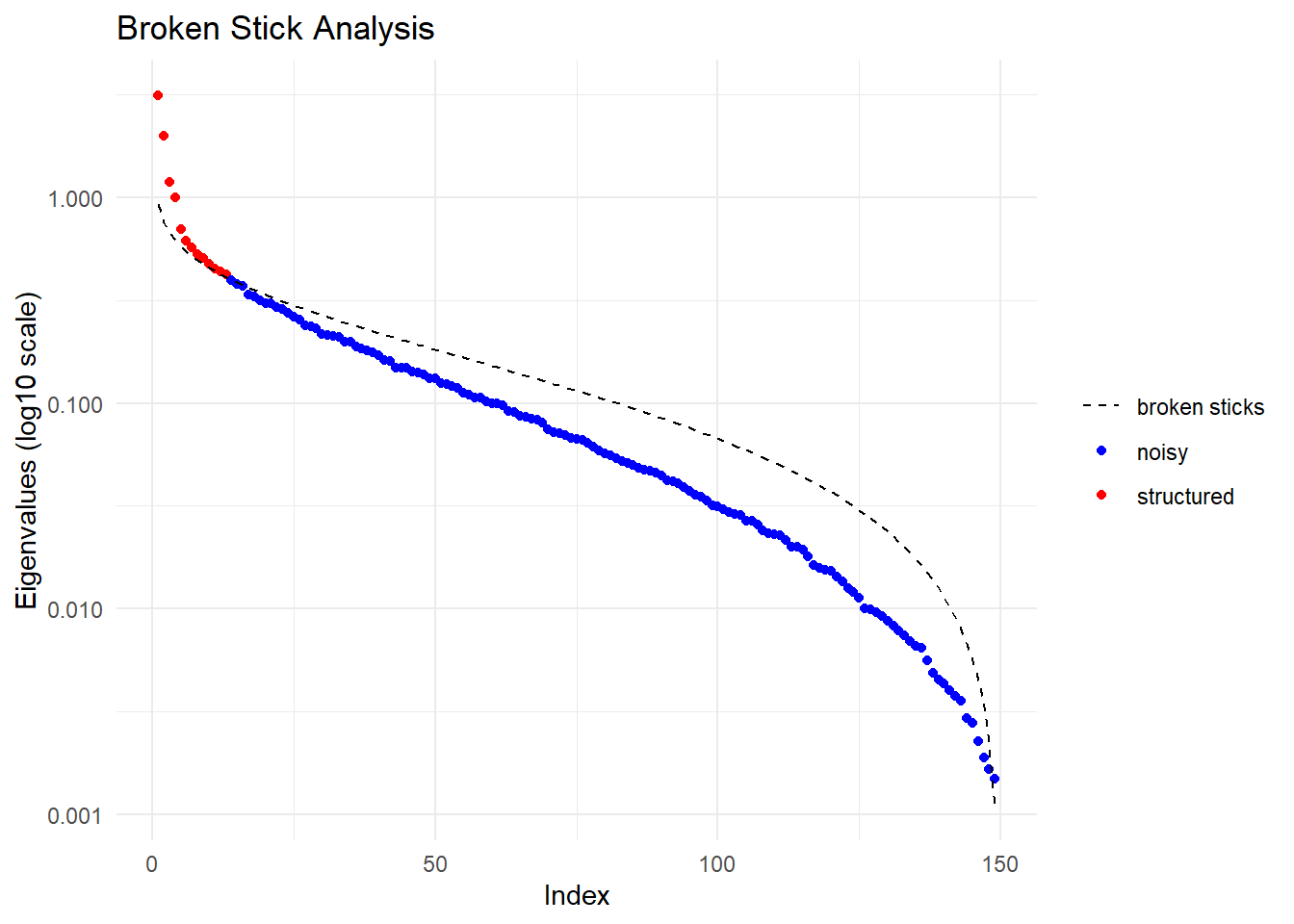
  Ordination yielded 13 informative dimensions( broken-stick criterion) from 149 original dimensions
    PCA Axis 1 explains 12.8 % of the total variance
    PCA Axis 1 and 2 combined explain 20.9 % of the total variance
    PCA Axis 1-3 combined explain 25.7 % of the total variance
Starting gl.colors
Selected color type 2
Completed: gl.colors 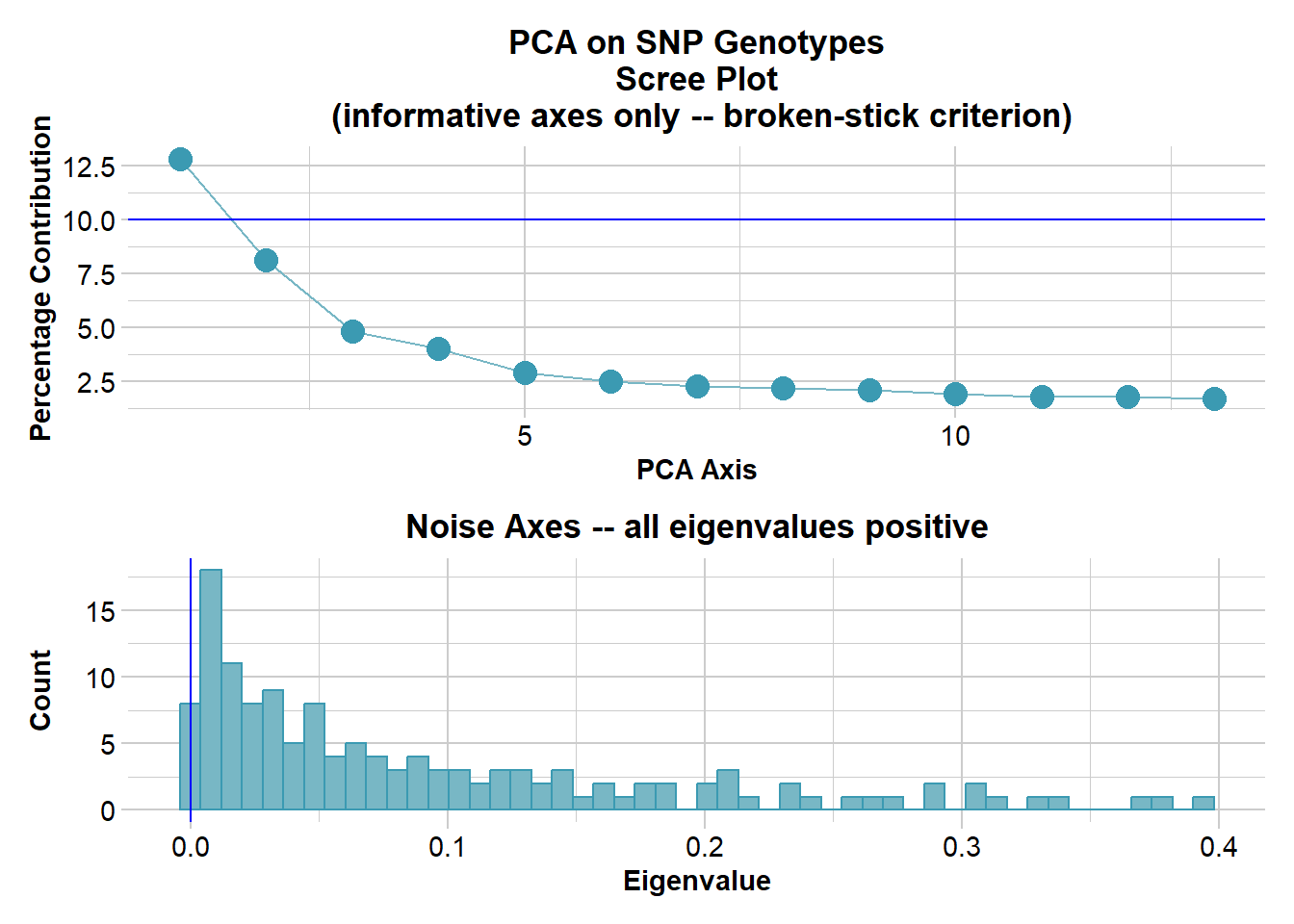
Completed: gl.pcoa pc_plot <- gl.pcoa.plot(glPca = pc, x = temp)Starting gl.pcoa.plot
Processing an ordination file (glPca)
Processing genlight object with SNP data
Plotting populations in a space defined by the SNPs
Preparing plot .... please wait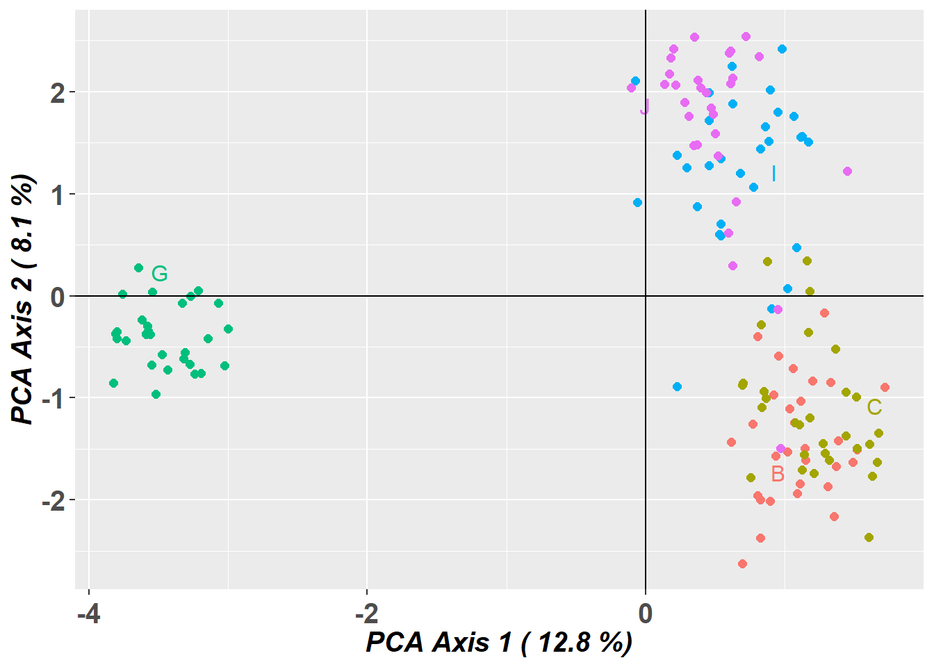
Completed: gl.pcoa.plot What can go wrong
PCA is a hypothesis generating tool, not a tool for definitive decisions of the structure of populations.
Missing data causes distortion, which can lead to misinterpretation.
dartR, that uses the adgenet package for its pca, fills missing data with the global average.
You can choose alternative methods of filling in the missing data prior to running your pca using the gl.impute function.
Structure variants can also turn up on a PCA, like an inversion.
PCA is sample size dependent - but this is more for the top two dimensions not all the informative dimensions.
Structure and FastStructure (Bayesian clustering models)
Structure attempts to find the number of populations or sources (K ) at which population genetics parameters (i.e. Hardy–Weinberg equilibrium within populations and linkage equilibrium between loci) are maximized.
Admixture Model
Definition: The admixture model assumes that individuals can have ancestry from multiple populations. This means that the genetic makeup of an individual can be a mixture of two or more populations. This model is particularly useful for analyzing genetic data from populations that are known to have mixed or where there is gene flow between populations.
Application: It is applied when there is historical or recent admixture between populations, and it allows for the estimation of individual ancestry proportions from each of the inferred clusters. For example, an individual might be 50% from population A, 30% from population B, and 20% from population C under the admixture model.
Utility: The admixture model can uncover complex patterns of genetic structure that are not apparent under the assumption of discrete, non-overlapping populations.
No-Admixture Model
Definition: The no-admixture model assumes that individuals have ancestry from only one population. This model is particularly useful for analyzing genetic data from populations that are known to be isolated from one another.
Application: This model is used in situations where populations are relatively well-defined and isolated, with little to no gene flow between them. It simplifies the analysis by considering that an individual’s entire genetic information originates from one of the K clusters without any mixture.
Utility: The no-admixture model is useful for identifying distinct populations and their members, especially in cases where populations are clearly separated geographically or temporally.
To run STRUCTURE from within R, we need to download the non-GUI executable (the version without frontend) for your operating system e.g windows, mac or linux. You can download STRUCTURE for your OS from http://web.stanford.edu/group/pritchardlab/structure_software/release_versions/v2.3.4/html/structure.html.
The possible arguments are listed below:
| parameter | description |
|---|---|
| k.range | vector of values to for maxpop in multiple runs. If set to NULL, a single STRUCTURE run is conducted with maxpops groups. If specified, do not also specify maxpops. |
| num.k.rep | number of replicates for each value in k.range. |
| label | label to use for input and output files |
| delete.files | logical. Delete all files when STRUCTURE is finished? |
| exec | name of executable for STRUCTURE. Defaults to “structure”. |
| burnin | number of iterations for MCMC burnin. |
| numreps | number of MCMC replicates. |
| noadmix | logical. No admixture? |
| freqscorr | logical. Correlated frequencies? |
| randomize | randomize. |
| pop.prior | a character specifying which population prior model to use: “locprior” or “usepopinfo”. |
| locpriorinit | parameterizes locprior parameter r - how informative the populations are. Only used when pop.prior = “locprior”. |
| maxlocprior | specifies range of locprior parameter r. Only used when pop.prior = “locprior”. |
| gensback | integer defining the number of generations back to test for immigrant ancestry. Only used when pop.prior = “usepopinfo”. |
| migrprior | numeric between 0 and 1 listing migration prior. Only used when pop.prior = “usepopinfo”. |
| popflag | a vector of integers (0, 1) or logicals identifying whether or not to use strata information. Only used when pop.prior = “usepopinfo”. |
| pops | vector of sampling location labels to be used in place of numbers in STRUCTURE file. |
Running STRUCTURE
structure_file <- if (Sys.info()[["sysname"]] == "Windows") {
  "./binaries/winbinaries/structure.exe"
} else if (Sys.info()[["sysname"]] == "Darwin") {
  "./binaries/macbinaries/structure"
} else {"./binaries/structure";
  system("chmod 777 ./binaries/structure")}


srnoad <- gl.run.structure(possums.gl, k.range = 2:7, num.k.rep = 2,
                           exec = structure_file,plot.out = FALSE,
                           burnin = 500, numreps = 1000,
                           noadmix = TRUE)
srnoad <- readRDS("data/srnoad.rds")Structure Results
Okay now that we got that out of our way lets see how to interpret the results of the structure run. However, to really trust our results we would want to run gl.run.structure with larger burn in and number of reps, more like burnin=50000 and numreps=100000. But this takes a while, so we will not be doing that today.
Evanno Plots
The Evanno method is a statistical approach used to determine the most likely number of genetic clusters (K) present in a dataset analyzed by STRUCTURE software. STRUCTURE is a computational tool used for inferring population structure using genetic data. Identifying the correct number of clusters (K) is crucial for accurately interpreting genetic data in the context of population structure, evolutionary biology, and conservation genetics. The Evanno method specifically addresses the challenge of choosing the optimal K by analyzing the rate of change in the likelihood of data between successive K values, rather than just relying on the maximum likelihood. This is done through the calculation of ΔK, a quantity based on the second order rate of change of the likelihood function with respect to K. The method suggests that the value of K corresponding to the highest ΔK should be considered the most likely number of clusters present in the dataset.
The Evanno method is a method to determine the most likely number of populations. It is based on the second order rate of change of the likelihood function with respect to K. The method is implemented in the gl.evanno function.
ev <- gl.evanno(srnoad)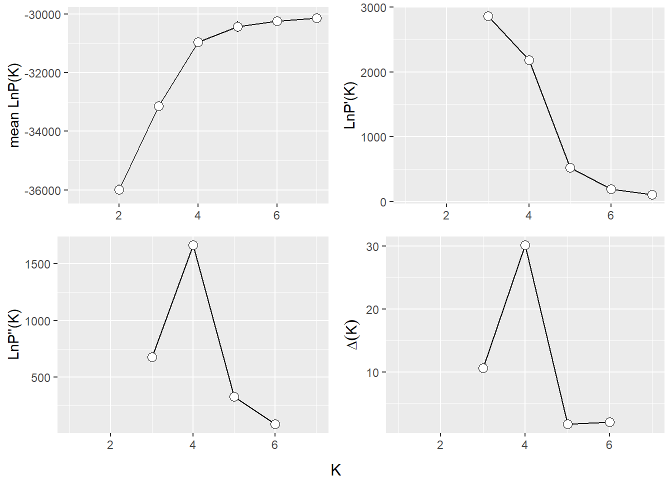
Plotting the results (Q matrix)
The Q matrix represents the estimated ancestry proportions of individuals across different inferred genetic clusters. STRUCTURE aims to identify K clusters (populations) that best explain the patterns of genetic variation observed in the data, with K either being predefined by the user or determined using methods like the Evanno method.
The Q matrix is essentially a matrix where each row corresponds to an individual in the dataset, and each column represents one of the K inferred genetic clusters. The entries in the matrix are the estimated proportions (ranging from 0 to 1) of each individual’s genome that originated from each cluster. The sum of an individual’s ancestry proportions across all K clusters equals 1.
The values in the Q matrix can be interpreted as the fraction of an individual’s ancestry that comes from each of the K clusters. The Q matrix is often visualized using bar plots or stacked bar graphs, where each individual’s ancestry proportions are shown as segments of a bar colored differently for each cluster.
To get a plot for a certain level you need to specify K or at least a range of K.
qmatnoad <- gl.plot.structure(srnoad, K = 3:5)Starting gl.plot.structure 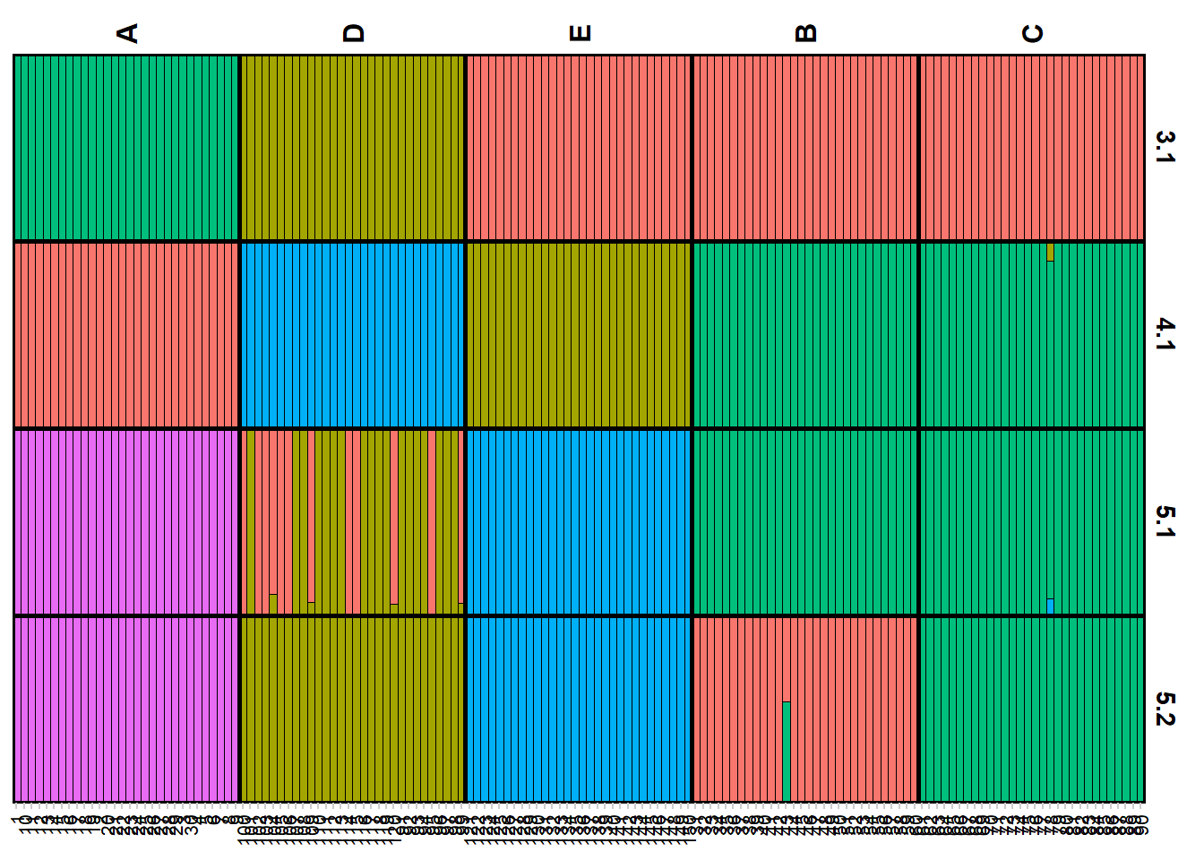
Completed: gl.plot.structure head(qmatnoad[[1]]) Label cluster1 cluster2 cluster3 K orig.pop ord
<char> <num> <num> <num> <char> <fctr> <int>
1: 1 0 1 0 3.1 A 1
2: 10 0 1 0 3.1 A 2
3: 100 0 0 1 3.1 D 91
4: 101 0 0 1 3.1 D 92
5: 102 0 0 1 3.1 D 93
6: 103 0 0 1 3.1 D 94A “spatial” structure plot
qmatnoad <- gl.plot.structure(srnoad, K = 4)Starting gl.plot.structure 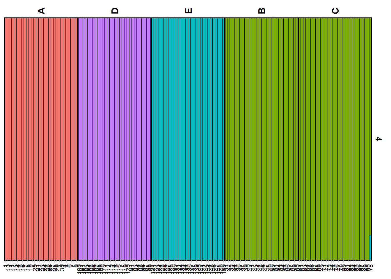
Completed: gl.plot.structure gm <- gl.map.structure(qmat = qmatnoad, x = possums.gl[1:150,], K = 4, scalex = 1, scaley = 0.5 )
gm$mapFaststructure
Faststructure is a faster implementation of the structure algorithm. Be aware though it is named Fast’structure’ it is a fairly different implementation of the original approach, hence the results might differ from the original STRUCTURE. The method is based on a variational Bayesian framework and is designed to be faster and more scalable than the original STRUCTURE software. It is particularly useful for analyzing large datasets with many individuals and/or many SNPs (>5000). One of the most important differences is that there is no no-admixture model in Faststructure, but you can run two models that allow for “complex” situations (logistic prior) and situations where the ancestry is more evenly distributed (simple prior). Also the way how to identify K differ between the methods. We will run the previous examples with both settings and compare the results.
The method is now implemented in the gl.run.faststructure function. Unfortunately noone to my knowledge has compiled Faststructure for windows, so it is only available for Linux and Mac. We also need to have plink installed as this is the required input format for faststructure.
Running Faststructure with simple prior
if (Sys.info()[["sysname"]] == "Windows") {
   print("fastStructure is not built fow Windows")
} else if (Sys.info()[["sysname"]] == "Darwin") {
  faststructure_file <- "./binaries/macbinaries/fastStructure"
  plink_file <- "./binaries/macbinaries/"
} else {
  faststructure_file <- "./binaries/fastStructure"
  plink_path <- "./binaries/"
  }
if (Sys.info()[["sysname"]] != "Windows") {
my_fast <- gl.run.faststructure(possums.gl,
                                k.range = 2:4,
                                num.k.rep = 1,
                                exec = faststructure_file,
                                exec.plink = plink_path, output = tempdir())

gl.plot.faststructure(sr = my_fast,k.range = 3, border_ind = 0)
}
Here we can check the marginal likelihoods for the different K values. The recommended K is then the one with the highest marginal likelihood at the lowest K possible. So here we would decide on K=4. As before we can plot the Q matrix and the spatial structure plot.
sNMF
sNMF is a fast alternative to conventional, model-based population structure analysis that uses matrix factorization to handle large, modern SNP datasets for inference of individual ancestry coefficients.
my_snmf <- gl.run.snmf(possums.gl, minK = 2, maxK = 7, rep = 2, regularization = 10)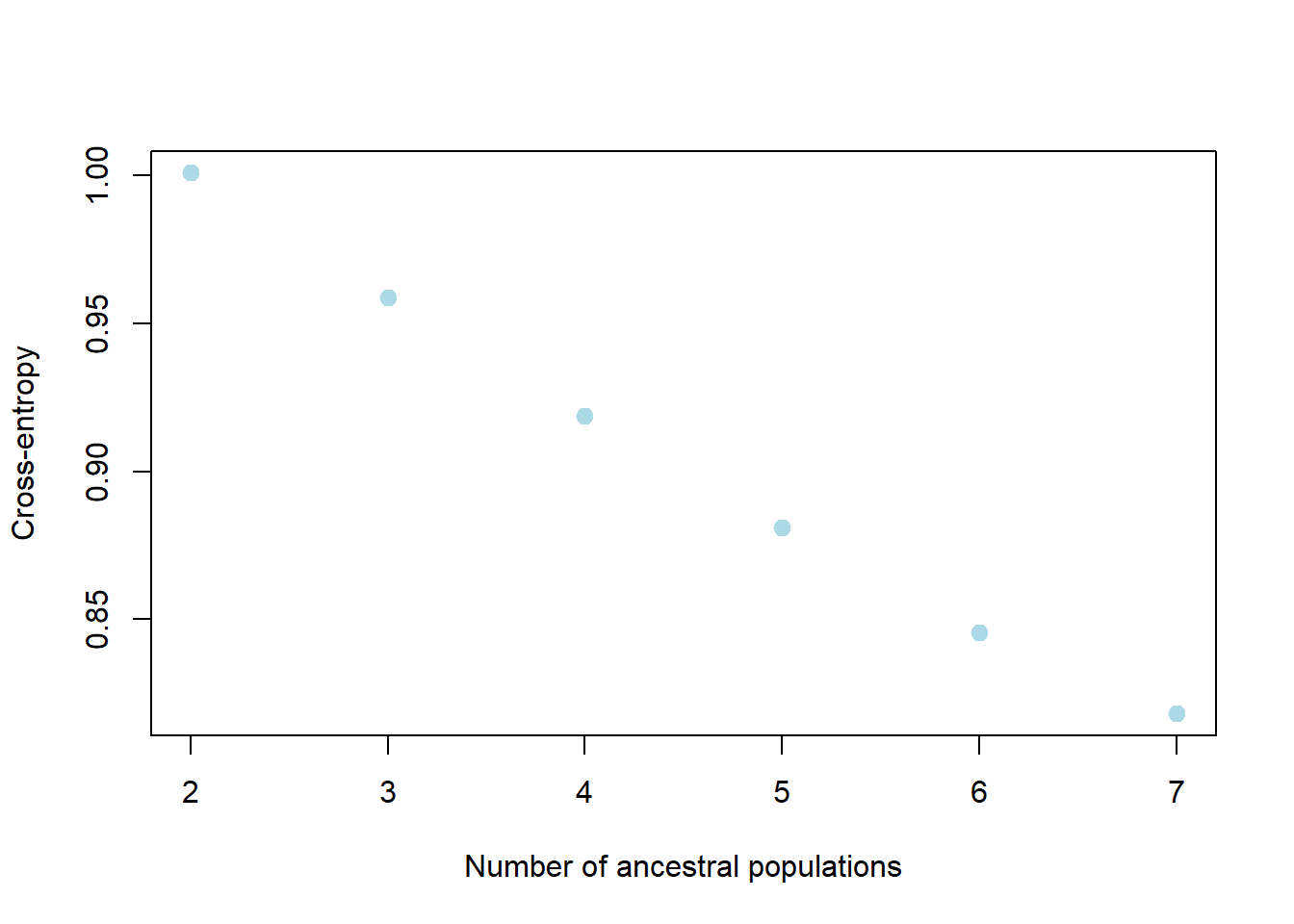
my_snmf_qmat <- gl.plot.snmf(snmf.result = my_snmf, plot.K = 3, border.ind = 0)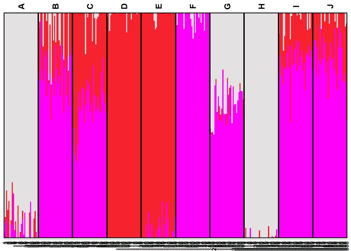
my_snmf_map <- gl.map.snmf(possums.gl, qmat = my_snmf_qmat)Joining with `by = join_by(Label)`my_snmf_map$mapPopCluster
PopCluster assumes the mixture model and adopts a simulated annealing algorithm to make a maximum likelihood clustering analysis, partitioning the sampled individuals into a predefined number of clusters.
popcluster_path <- if (Sys.info()[["sysname"]] == "Windows") {
  "./binaries/winbinaries/"
} else if (Sys.info()[["sysname"]] == "Darwin") {
  "./binaries/macbinaries/"
} else {"./binaries/"}

my_popcluster <- gl.run.popcluster(x = possums.gl, minK = 2, maxK = 7, rep = 2,
                                   Scaling = 0, popcluster.path = popcluster_path)
my_popcluster <- readRDS("data/my_popcluster.rds")my_popcluster$plots$LogL_Mean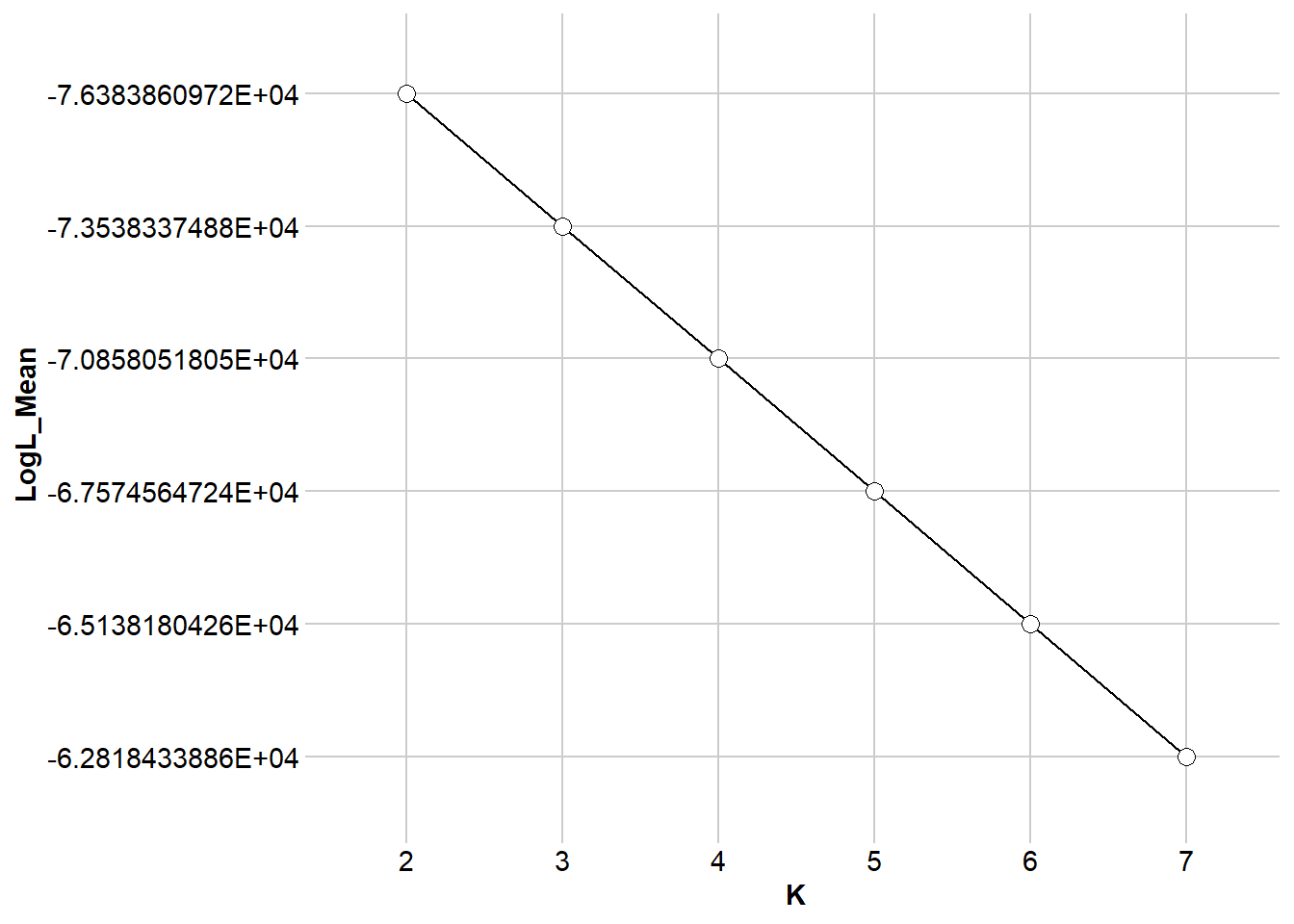
$DLK1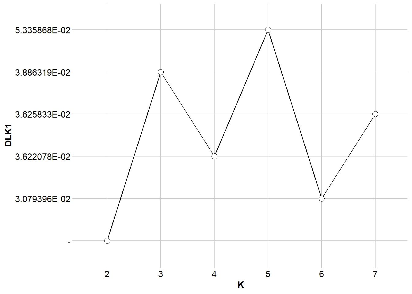
$DLK2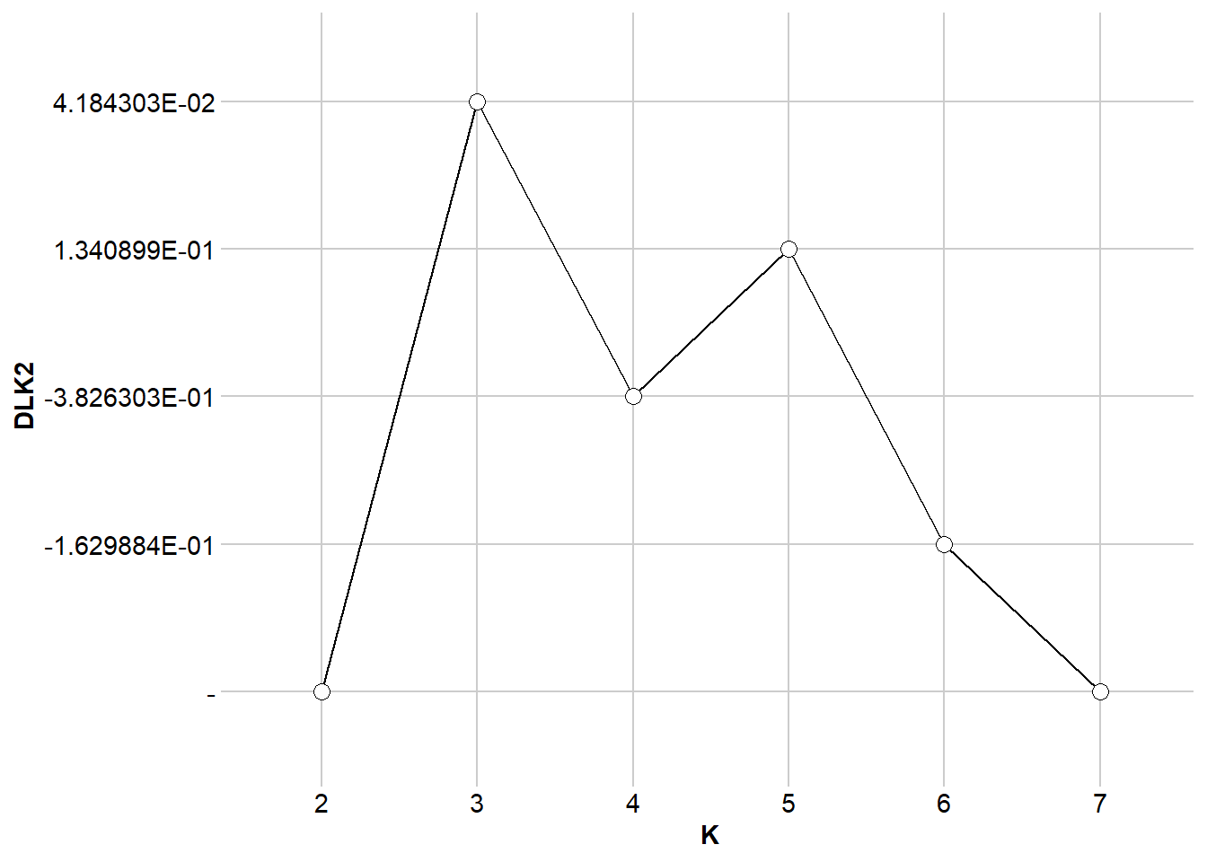
$FST.FIS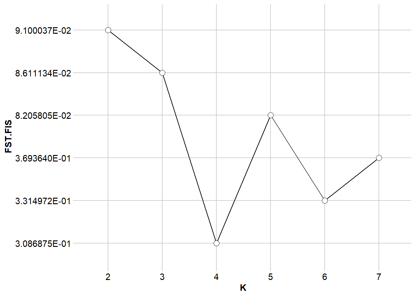
my_plot_popcluster <- gl.plot.popcluster(my_popcluster,plot.K = 3)Starting gl.plot.popcluster 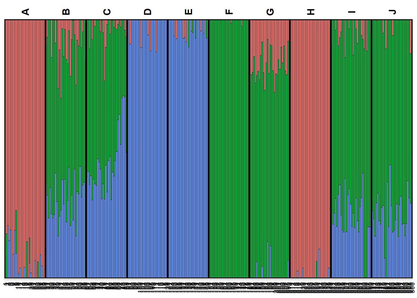
Completed: gl.plot.popcluster my_map_popcluster <- gl.map.popcluster(x = possums.gl, qmat = my_plot_popcluster)Joining with `by = join_by(Label)`my_map_popcluster$map# htmlwidgets::saveWidget(widget = my_map_popcluster$map, file = "possum_popcluster_map.html") ##to saveEXERCISES
Exercise data 1 - Your own data

TipHINT
You can have a look at the exercise data below for inspiration.
Exercise data 2: School shark - kinship bias
Data from Devloo-Delva et al. (2019)

schoolshark.gl <- readRDS("data/school_shark.rds")
table(pop(schoolshark.gl))
TAS NZd
 46  41
PCA
Lets take at a look at the pca.
# Undertake a PCA on the raw data
# new dartRverse>=1.1.2 speed up using different memory model
class(schoolshark.gl)<- "dartR"
if (existsFunction("gl.gen2fbm")) schoolshark.gl <- gl.gen2fbm(schoolshark.gl)
Starting gl.gen2fbm
Processing genlight object with SNP data
Completed: gl.gen2fbm pc <- gl.pcoa(schoolshark.gl, verbose = 3)Starting gl.pcoa
Processing genlight object with SNP data
Performing a PCA, individuals as entities, loci as attributes, SNP genotype as state
Starting gl.impute
Processing genlight object with SNP data
Imputation based on average allele frequencies, population-wise
Imputation based on average allele frequencies, population-wise
Residual missing values were filled randomly drawing from the global allele profiles by locus
Imputation method: frequency
No. of missing values before imputation: 3066
No. of loci with all NA's for any one population before imputation: 0
No. of values imputed: 3066
No. of missing values after imputation: 0
No. of loci with all NA's for any one population after imputation: 0
Completed: gl.impute 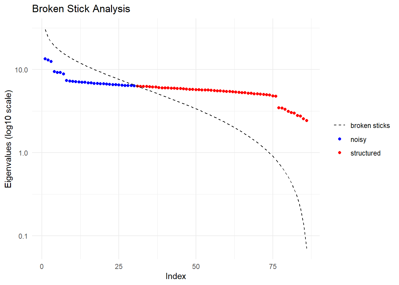
  Ordination yielded 56 informative dimensions( broken-stick criterion) from 86 original dimensions
    PCA Axis 1 explains 1.2 % of the total variance
    PCA Axis 1 and 2 combined explain 2.4 % of the total variance
    PCA Axis 1-3 combined explain 3.6 % of the total variance
Starting gl.colors
Selected color type 2
Completed: gl.colors 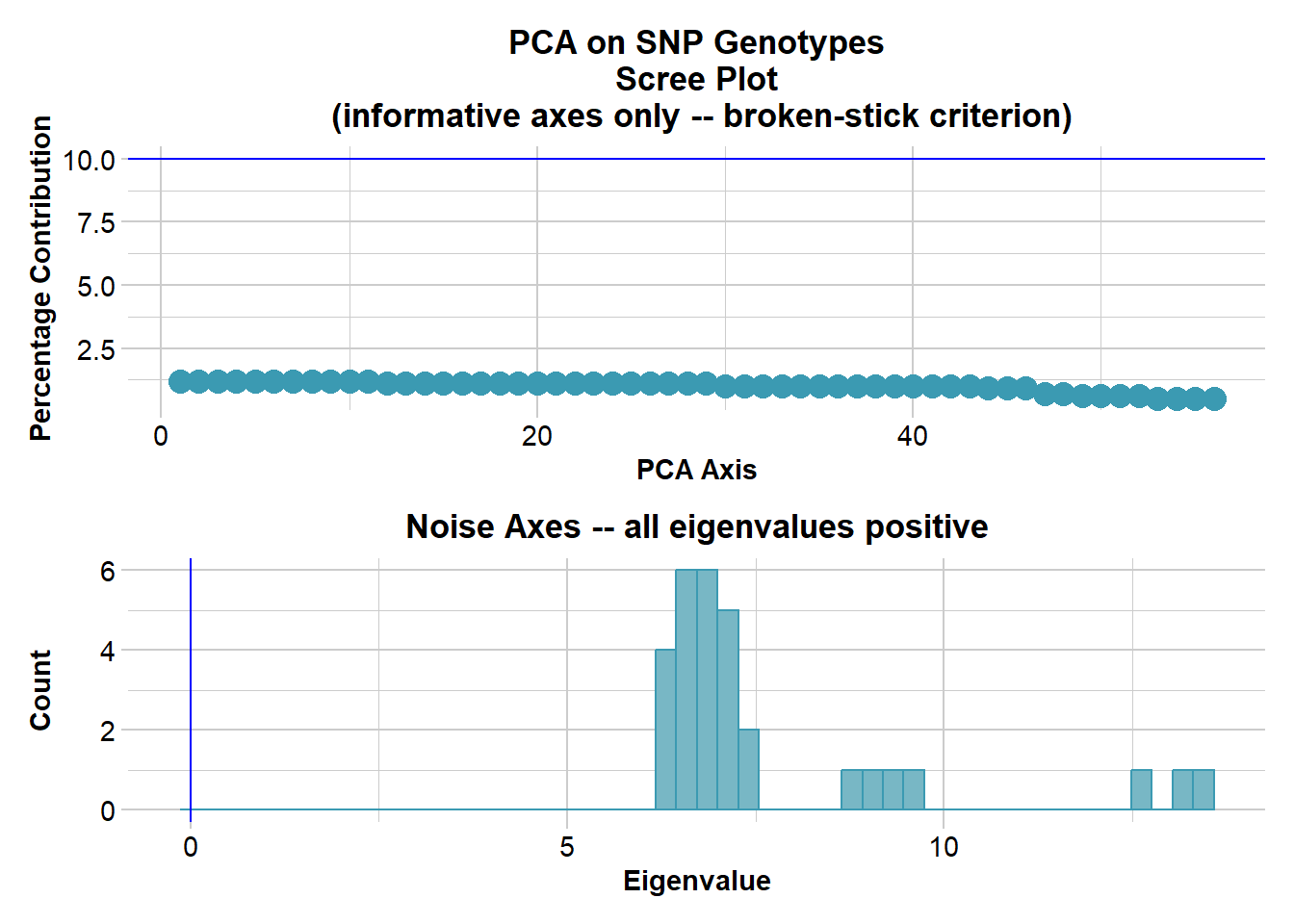
Completed: gl.pcoa # Plot the first two dimensions of the PCA
pc_a1a2 <- gl.pcoa.plot(glPca = pc, x = schoolshark.gl)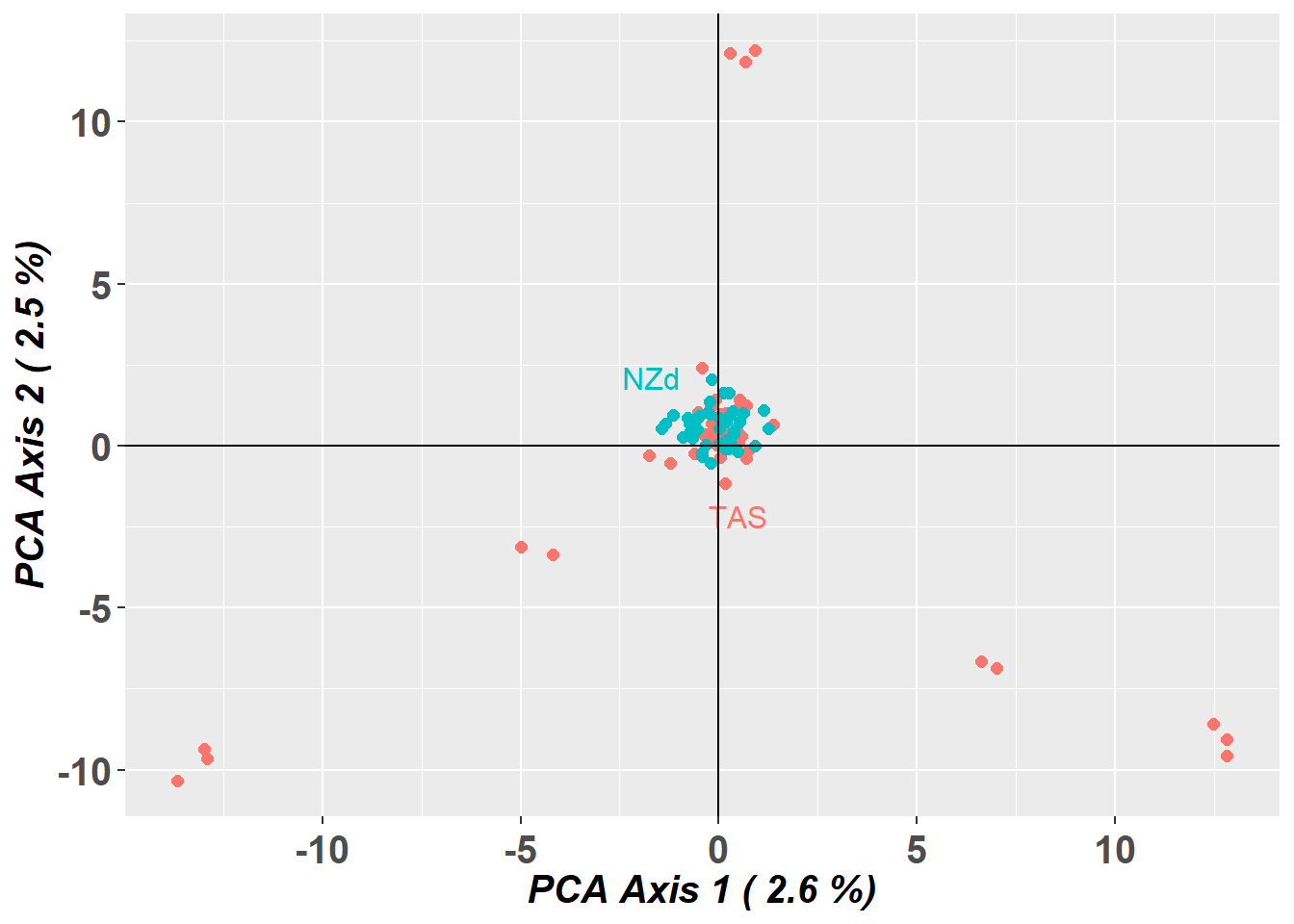
# Plot the first and third dimensions of the PCA
pc_a1a3 <- gl.pcoa.plot(glPca = pc, x = schoolshark.gl, xaxis = 1, yaxis = 3)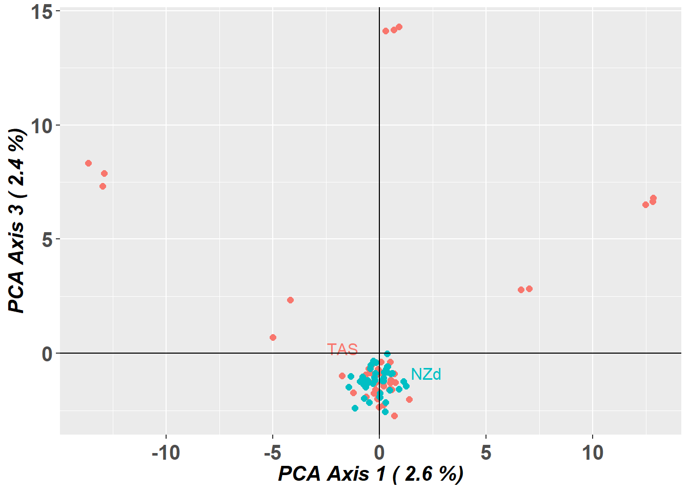
# Plot the first three dimensions of the PCA
pc_a1a3 <- gl.pcoa.plot(glPca = pc, x = schoolshark.gl, xaxis = 1, yaxis = 2, zaxis = 3)
Warning in RColorBrewer::brewer.pal(N, "Set2"): minimal value for n is 3, returning requested palette with 3 different levels
Warning in RColorBrewer::brewer.pal(N, "Set2"): minimal value for n is 3, returning requested palette with 3 different levels
NoteExercise 2
![]()
Do other analytical tools have the same issue as this PCA?
How would you deal with the bias from this data?
TipHINT
You can identify individuals driving the pattern, by looking at the rownames of PC2
sort(pc$scores[,2])
Exercise data 3: Blue shark - Structural variant bias
Data from Nikolic et al. (2023).

blueshark.gl <- readRDS("data/blue_shark.rds")

table(pop(blueshark.gl))
    Atlantic-N Mediterranean1     Atlantic-W    Atlantic-SW      Indian-SW
            48             34             34             21             22
      Indian-N     Pacific-SW     Pacific-SE
            22             55             19
PCA
Lets take at a look at the pca
# Undertake a PCA on the raw data
# new dartRverse>=1.1.2 speed up using different memory model
class(blueshark.gl)<- "dartR"
if (existsFunction("gl.gen2fbm")) bs <- gl.gen2fbm(blueshark.gl)
Starting gl.gen2fbm
Processing genlight object with SNP data
Completed: gl.gen2fbm pc <- gl.pcoa(bs, verbose = 3)Starting gl.pcoa
Processing genlight object with SNP data
Performing a PCA, individuals as entities, loci as attributes, SNP genotype as state
Starting gl.impute
Processing genlight object with SNP data
Imputation based on average allele frequencies, population-wise
Imputation based on average allele frequencies, population-wise
Imputation based on average allele frequencies, population-wise
Imputation based on average allele frequencies, population-wise
Imputation based on average allele frequencies, population-wise
Imputation based on average allele frequencies, population-wise
Imputation based on average allele frequencies, population-wise
Imputation based on average allele frequencies, population-wise
Warning: Population Pacific-SE has 3 loci with all missing values.
Method= 'frequency': 8768 values to be imputed.
Residual missing values were filled randomly drawing from the global allele profiles by locus
Imputation method: frequency
No. of missing values before imputation: 85626
No. of loci with all NA's for any one population before imputation: 3
No. of values imputed: 85626
No. of missing values after imputation: 0
No. of loci with all NA's for any one population after imputation: 0
Completed: gl.impute 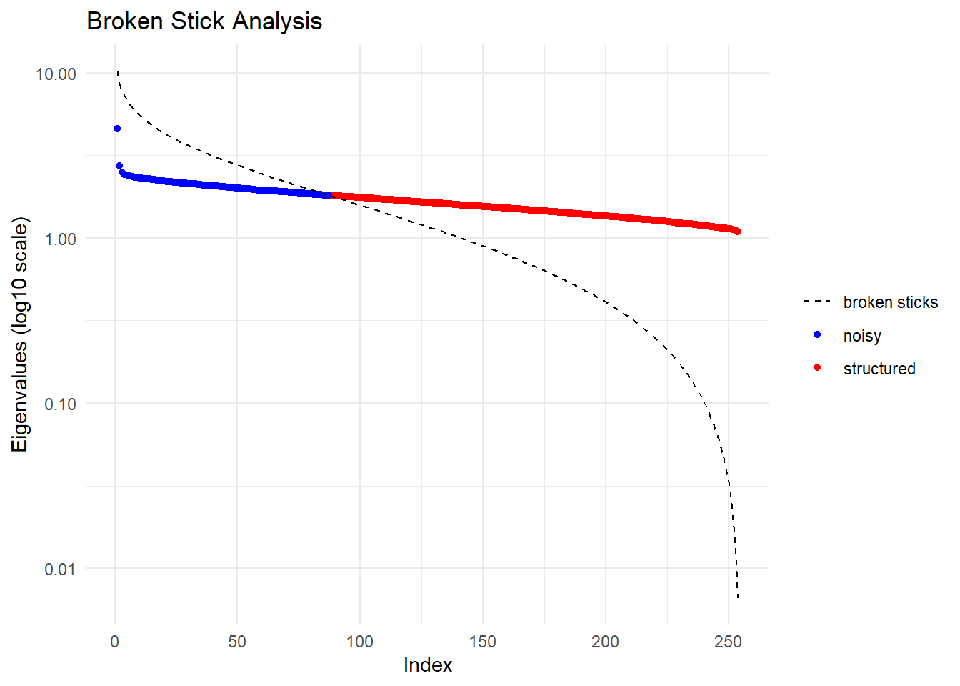
  Ordination yielded 168 informative dimensions( broken-stick criterion) from 254 original dimensions
    PCA Axis 1 explains 0.4 % of the total variance
    PCA Axis 1 and 2 combined explain 0.8 % of the total variance
    PCA Axis 1-3 combined explain 1.2 % of the total variance
Starting gl.colors
Selected color type 2
Completed: gl.colors 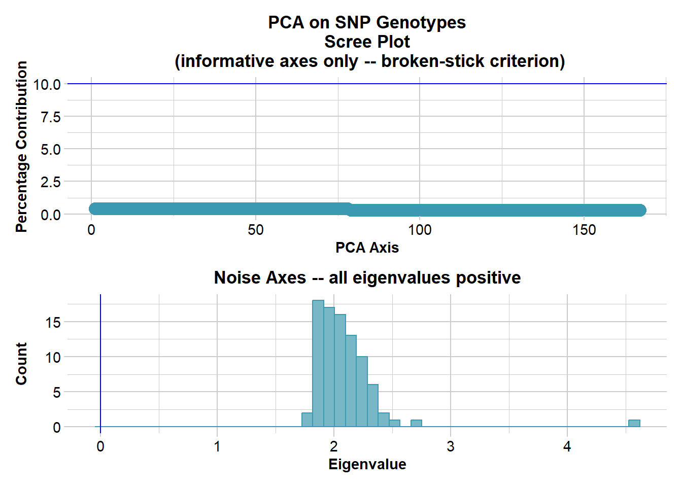
Completed: gl.pcoa # Plot the first two dimensions of the PCA
pc_a1a2 <- gl.pcoa.plot(glPca = pc, x = blueshark.gl)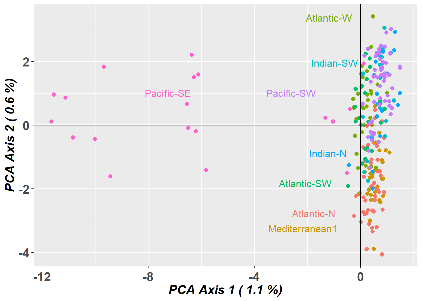
# Plot the first and third dimensions of the PCA
pc_a1a3 <- gl.pcoa.plot(glPca = pc, x = blueshark.gl, xaxis = 1, yaxis = 3)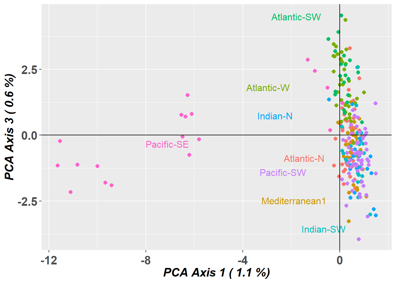
# Plot the first three dimensions of the PCA
pc_a1a3 <- gl.pcoa.plot(glPca = pc, x = blueshark.gl, xaxis = 1, yaxis = 2, zaxis = 3)
Lets have a look at which markers are contributing to the differentiation along PC1
loadings <- gl.report.factorloadings(
  pc, axis = 1,
  n.display = nLoc(blueshark.gl)
)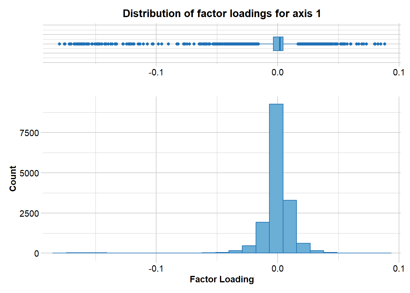
# plot(loadings$pca.loadings...axis.)

loadings_df <- data.frame(SNP = blueshark.gl$loc.names,
                          CHR = blueshark.gl$chromosome,
                          loading = loadings$pca.loadings...axis.)
loadings_plot <- ggplot2::ggplot(loadings_df,
                                 ggplot2::aes(x = SNP,
                                              y = loading,
                                              colour = CHR)) +
  ggplot2::geom_point(size = 2) +
  ggplot2::scale_colour_manual(values = adegenet::funky(55)) +
  ggplot2::theme(
    axis.text.x = ggplot2::element_blank(),
    axis.title.x = ggplot2::element_blank(),
    axis.title.y = ggplot2::element_text(size = 10),
    legend.position = "none"
)print(loadings_plot)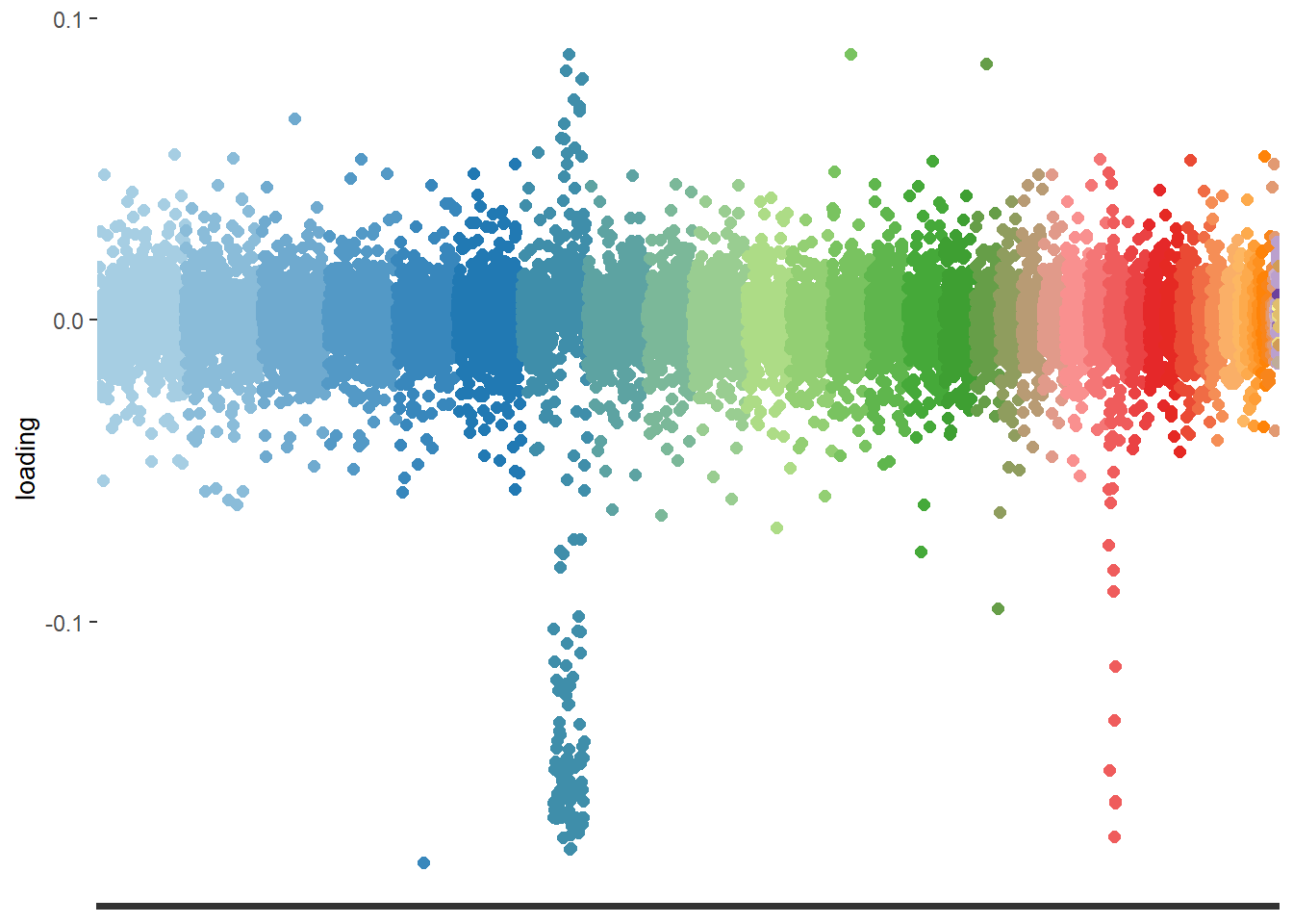
NoteExercise 3
![]()
These closely located markers would indicate a chromosomal inversion.
How would you remove bias due to structural variants?
Would you consider the observed signal an artefact or a signature of genetic structure?
TipHINT
Try removing markers on chromosome 7:
blueshark_noSV.gl <- blueshark.gl[,blueshark.gl$chromosome != "JBBMRE010000007_1"]
Exercise data 4: Bull shark - Uneven sampling design
Data from Devloo-Delva et al. (2023).

bullshark.gl <- readRDS("data/bull_shark.rds")

table(pop(bullshark.gl))
E-PAC W-ATL E-ATL  W-IO  N-IO  E-IO W-PAC Japan  Fiji
   16    97     1    97    32   294   153    23    25
PCA
Lets take at a look at the PCA
# new dartRverse>=1.1.2 speed up using different memory model
class(bullshark.gl)<- "dartR"
if (existsFunction("gl.gen2fbm")) bullshark.gl <- gl.gen2fbm(bullshark.gl)
Starting gl.gen2fbm
Processing genlight object with SNP data
Completed: gl.gen2fbm # Undertake a PCA on the raw data
pc <- gl.pcoa(bullshark.gl, verbose = 3)Starting gl.pcoa
Processing genlight object with SNP data
Performing a PCA, individuals as entities, loci as attributes, SNP genotype as state
Starting gl.impute
Processing genlight object with SNP data
Imputation based on average allele frequencies, population-wise
Warning: Population E-PAC has 25 loci with all missing values.
Method= 'frequency': 795 values to be imputed.
Imputation based on average allele frequencies, population-wise
Warning: Population W-ATL has 5 loci with all missing values.
Method= 'frequency': 6419 values to be imputed.
Imputation based on average allele frequencies, population-wise
Imputation based on average allele frequencies, population-wise
Imputation based on average allele frequencies, population-wise
Imputation based on average allele frequencies, population-wise
Imputation based on average allele frequencies, population-wise
Imputation based on average allele frequencies, population-wise
Warning: Population Japan has 1 loci with all missing values.
Method= 'frequency': 940 values to be imputed.
Imputation based on average allele frequencies, population-wise
Warning: Population Fiji has 2 loci with all missing values.
Method= 'frequency': 5014 values to be imputed.Warning: Setting row names on a tibble is deprecated.
Setting row names on a tibble is deprecated.
Setting row names on a tibble is deprecated.
Setting row names on a tibble is deprecated.
Setting row names on a tibble is deprecated.
Setting row names on a tibble is deprecated.
Setting row names on a tibble is deprecated.
Setting row names on a tibble is deprecated.
Setting row names on a tibble is deprecated. Residual missing values were filled randomly drawing from the global allele profiles by locus
Imputation method: frequency
No. of missing values before imputation: 41748
No. of loci with all NA's for any one population before imputation: 33
No. of values imputed: 41748
No. of missing values after imputation: 0
No. of loci with all NA's for any one population after imputation: 0
Completed: gl.impute 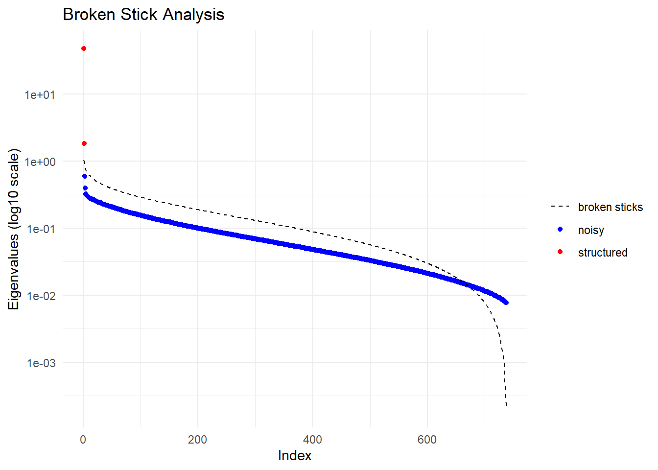
  Ordination yielded 2 informative dimensions( broken-stick criterion) from 737 original dimensions
    PCA Axis 1 explains 45.2 % of the total variance
    PCA Axis 1 and 2 combined explain 46.9 % of the total variance
    PCA Axis 1-3 combined explain NA % of the total variance
Starting gl.colors
Selected color type 2
Completed: gl.colors 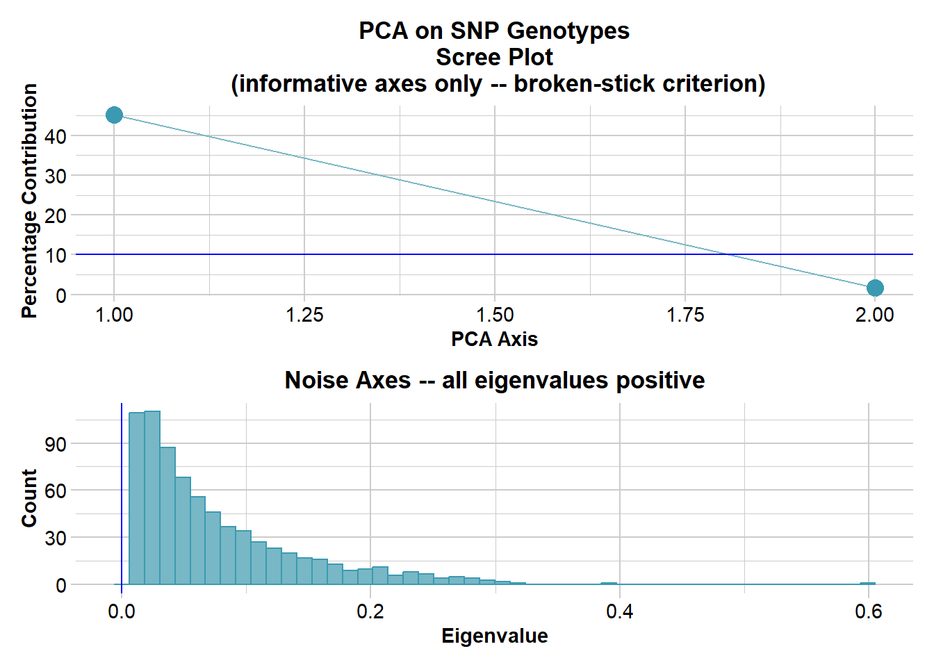
Completed: gl.pcoa # Plot the first two dimensions of the PCA
pc_a1a2 <- gl.pcoa.plot(glPca = pc, x = bullshark.gl)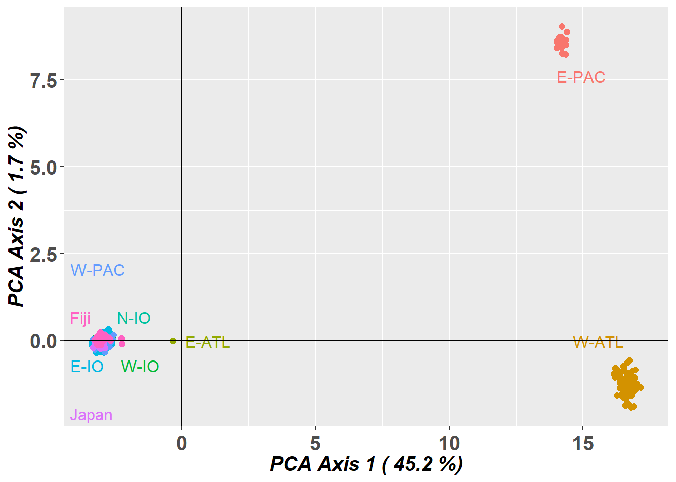
# Plot the first and third dimensions of the PCA
pc_a1a3 <- gl.pcoa.plot(glPca = pc, x = bullshark.gl, xaxis = 1, yaxis = 3)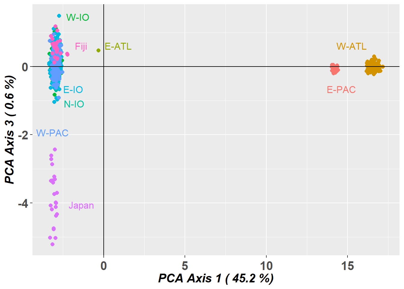
# Plot the first and third dimensions of the PCA
pc_a3a4 <- gl.pcoa.plot(glPca = pc, x = bullshark.gl, xaxis = 3, yaxis = 4)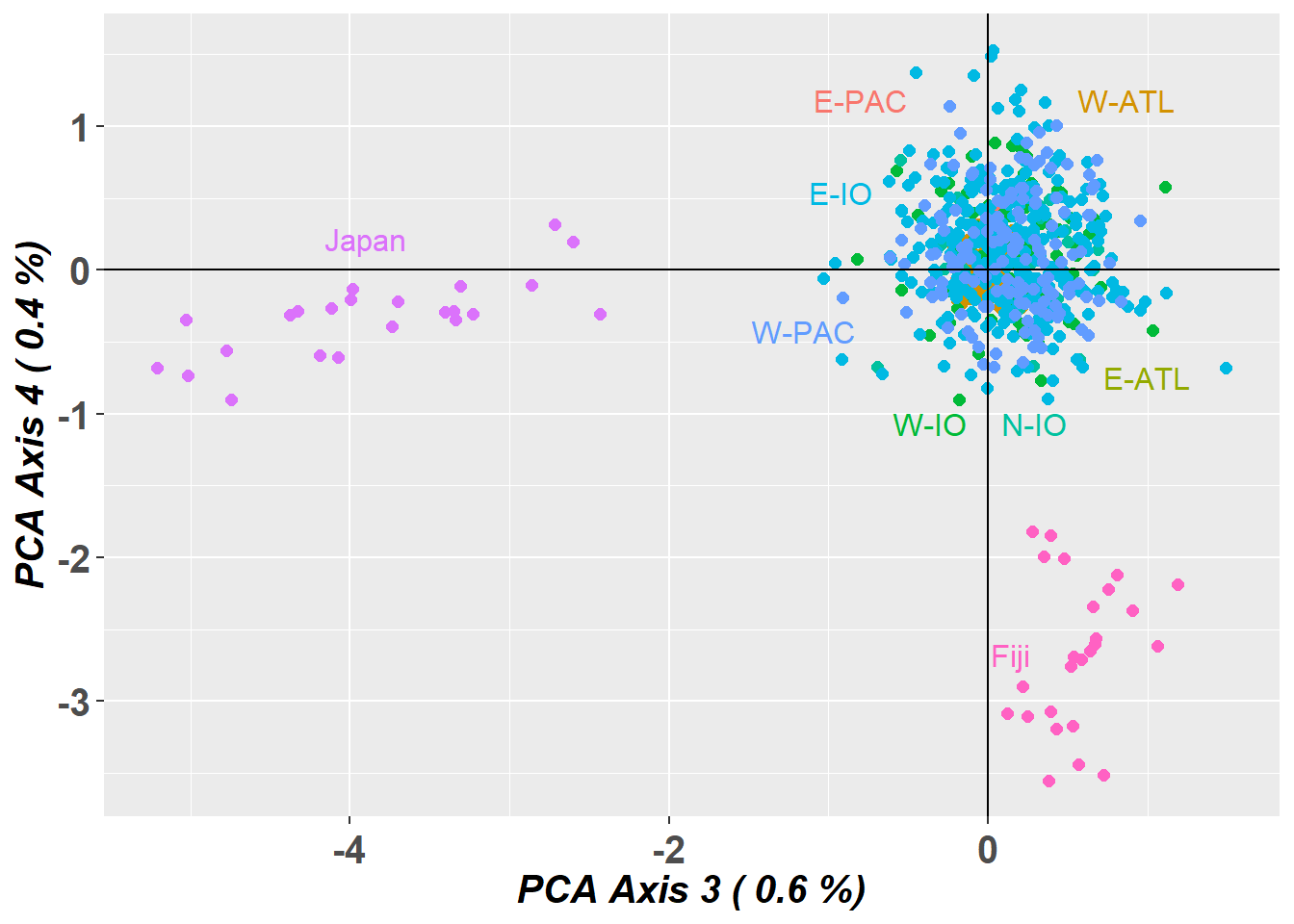
STRUCTURE
WARNING, the STRUCTURE analysis take a long time. Instead, load the output data
structure_file <- ifelse(Sys.info()["sysname"] == "Windows",
                         './binaries/winbinaries/structure.exe', './binaries/structure')
bullshark_srnoad <- gl.run.structure(bullshark.gl, k.range = 2:7, num.k.rep = 2,
                           exec = structure_file,plot.out = FALSE,
                           burnin = 500, numreps = 1000,
                           noadmix = TRUE)
saveRDS(bullshark_srnoad, file = "data/bull_shark_structure_subset.rds")
plot the STRUCTURE output
bullshark_srnoad <- readRDS("data/bull_shark_structure.rds")

ev <- gl.evanno(bullshark_srnoad)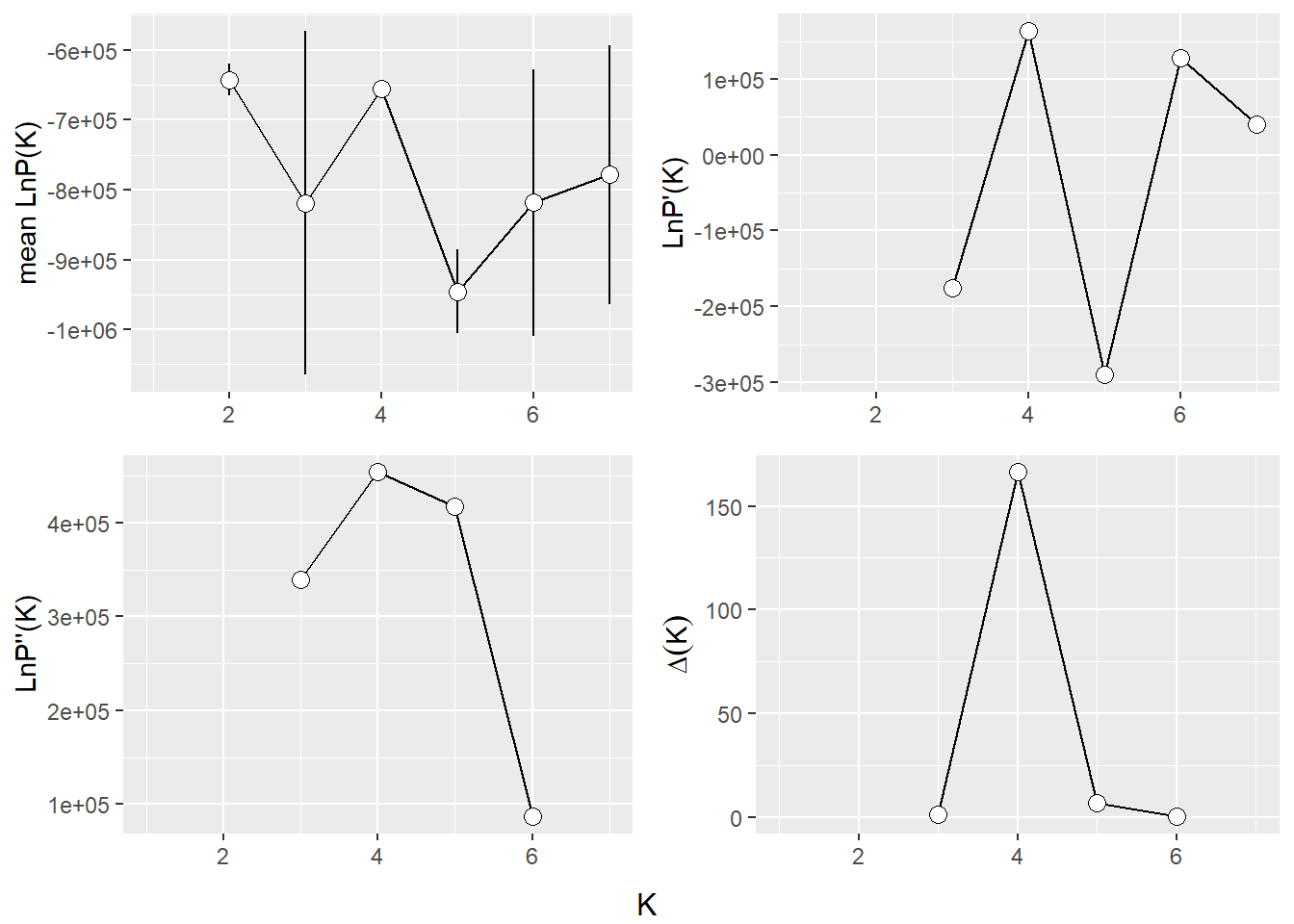
qmatnoad <- gl.plot.structure(bullshark_srnoad, K = 3:7)Starting gl.plot.structure 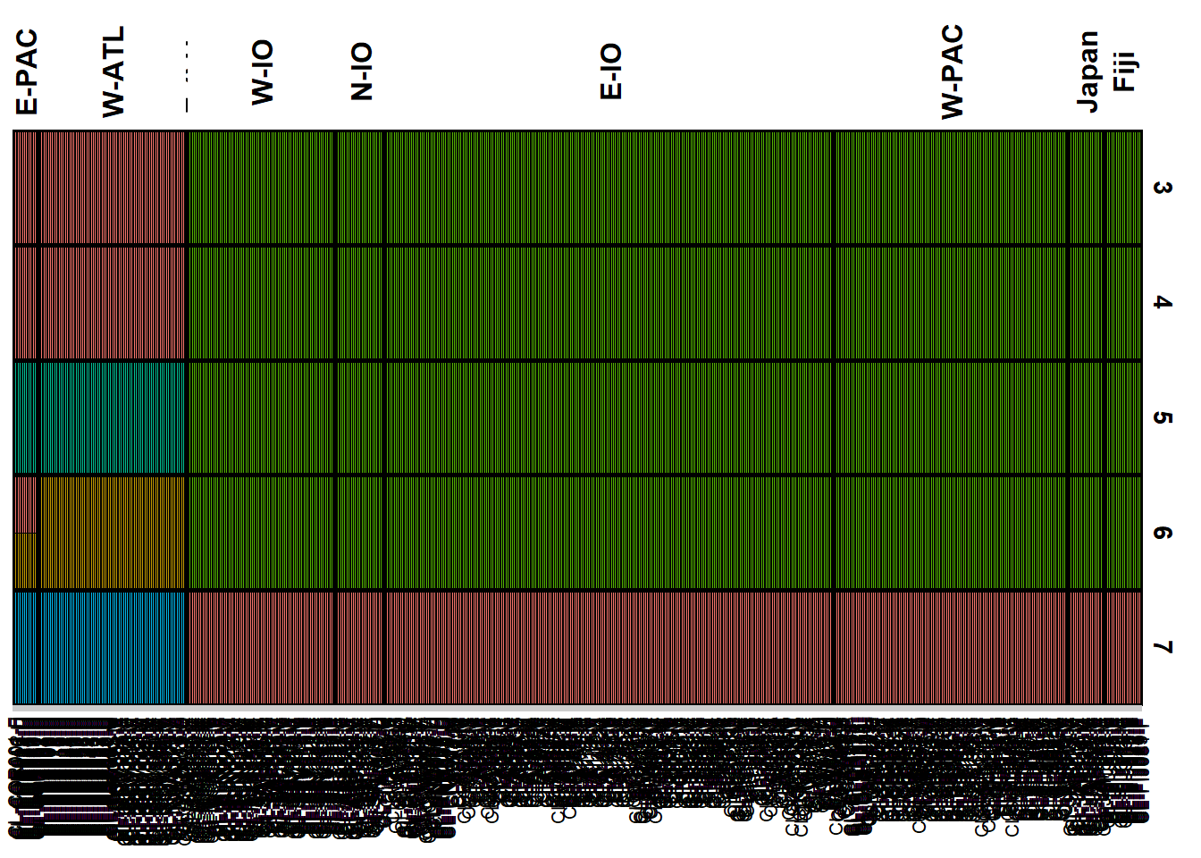
Completed: gl.plot.structure head(qmatnoad[[1]]) Label cluster1 cluster2 cluster3 K orig.pop ord
<char> <num> <num> <num> <char> <fctr> <int>
1: CL-ARS001-F 0 0 1 3 N-IO 215
2: CL-ARS002-M 0 0 1 3 N-IO 216
3: CL-ARS004-F 0 0 1 3 N-IO 217
4: CL-ARS005-F 0 0 1 3 N-IO 218
5: CL-ARS010-F 0 0 1 3 N-IO 219
6: CL-ARS012-F 0 0 1 3 N-IO 220sNMF
my_snmf <- gl.run.snmf(bullshark.gl, minK = 2, maxK = 7, rep = 2, regularization = 10)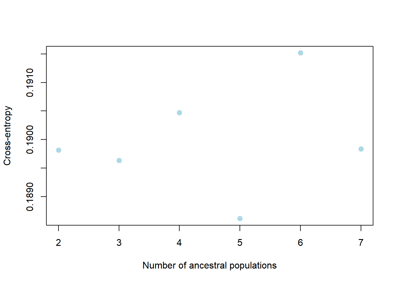
gl.plot.snmf(snmf.result = my_snmf, plot.K = 7, border.ind = 0)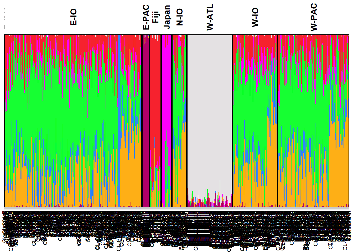
NoteExercise 4
![]()
How would you remove the bias due to uneven sampling design?
Can you interpret genetic structure from a sampling location with sample size n = 1?
Which analytical tools are better at handling uneven sampling design?
TipHINT
You might try to randomly subsample individuals from the Indo-West Pacific groups:
id.sub <- c(bullshark.gl$ind.names[bullshark.gl$pop %in% c("E-PAC", "W-ATL", "E-ATL", "Japan", "Fiji")], sample(bullshark.gl$ind.names[bullshark.gl$pop %in% c("W-IO", "N-IO", "E-IO", "W-PAC")], size = 60))
bullshark_subset.gl <- bullshark.gl[bullshark.gl$ind.names %in% id.sub,]
You could also try using PopCluster with the scaling=3 (see (wang2025popcluster?))
Winding up
Discussion time
Where did you see evidence of bias in the structure analyses?
How did you deal with the bias?
Which analysis was better at dealing with your bias?
Further Study
Readings
• Evanno et al. 2005 – Detecting the number of clusters (ΔK).
• Lawson et al. 2018 – How not to over-interpret STRUCTURE/ADMIXTURE plots.
• Wang 2017 – Common pitfalls when using STRUCTURE.
• Raj et al. 2014 – fastSTRUCTURE.
• Frichot et al. 2014 – sNMF.
• Wang 2022 – POPCLUSTER.
• Kopelman et al. 2015 – CLUMPAK.
• Jakobsson & Rosenberg 2007 – CLUMPP.