library(dartRverse)
library(ggplot2)
library(dismo)
library(leaflet)
library(htmltools)
library(leaflegend)
library(sf)
library(raster)
library(terra)
library(GGally)
library(ResistanceGA)8 Landscape Genetics
Session Presenters

Required packages
make sure you have the packages installed, see Install dartRverse
Introduction
Landscape genetics combines landscape ecology with population genetics to understand how the structure, composition and configuration of the landscape affects gene flow, genetic drift, and selection.
In this tutorial, we will dive into the first question - how does the landscape influence gene flow? There are many ways to tackle this question, for example, we can explore gene flow at the individual or population level, over different spatial scales, and/or across a meta-population.
Here we’ll start with the basics, by looking at the spatial distribution of individuals, and build on this until we incorporate landscape features, to understand:
Different dispersal strategies; and
Limitations to gene flow, including:
a) Geographic distance (isolation-by-distance);
b) Geographic barriers (isolation-by-barrier);
c) Landscape attributes (isolation-by-resistance).
1. Dispersal strategies
Many biological and demographic processes can shape patterns of genetic structure, for example, dispersal strategies, mating systems, and social behaviours. These processes often occur over a fine scale. As such, exploring patterns within populations over 10s-100s of metres can be very informative, especially in small and inconspicuous species.
Before diving into more complex and correlative analyses, it is useful to understand some of the baseline life-history and demographic traits in your species. One common question is: how far do individuals disperse and is this the same or different for males and females?
When one sex disperses further than the other, this is known as sex-biased dispersal. This can be detected via genetic spatial autocorrelation analysis. We’ll describe this in more detail later on, but in short, increased philopatry by one sex results in greater genetic similarity among neighbouring individuals, while genetic similarity is reduced in the dispersing sex. You can also learn more about it in Banks & Peakall 2012 (and references therein).
What is philopatry?
Natal philopatry describes when an animal remains close or returns to the area where they were born.
To explore the genetic patterns that result from sex-biased dispersal, we’re going to simulate this process in a hypothetical animal population. First, we need to set up the dispersal kernels, using the custom function below.
# Create a function, where:
# x = minimum to maximum distance,
# d0 = mean distance,
# p= proportion that go to mean
p2p <- function(x, d0, p)
{
return (exp(((x/d0)*log(p))))
}
# Dispersal kernels:
# Females
dispfemale <- (p2p(x = 1:50, # range of distances
d0 = 1, # mean dispersal distance
p = 0.5)) # proportion that go to mean
pdispfemale <- c(0, cumsum(dispfemale)/sum(dispfemale))
# Males
dispmale <- (p2p(x = 1:50, # range of distances
d0 = 20, # mean dispersal distance
p = 0.5)) # proportion that go to mean
pdispmale <- c(0, cumsum(dispmale)/sum(dispmale))Let’s look at the dispersal curves. In this case, males disperse further than females (i.e., there is male-biased dispersal):
# Plot
plot(dispfemale,
type = "l",
col = '#E69F00',
lwd = 2,
main = "Female dispersal curve",
xlab = "Distance (m)",
ylab = "")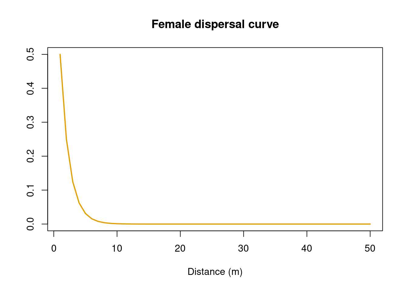
plot(dispmale,
type = "l",
lwd = 2,
col = '#5D3FD3',
main = "Male dispersal curve",
xlab = "Distance (m)",
ylab = "")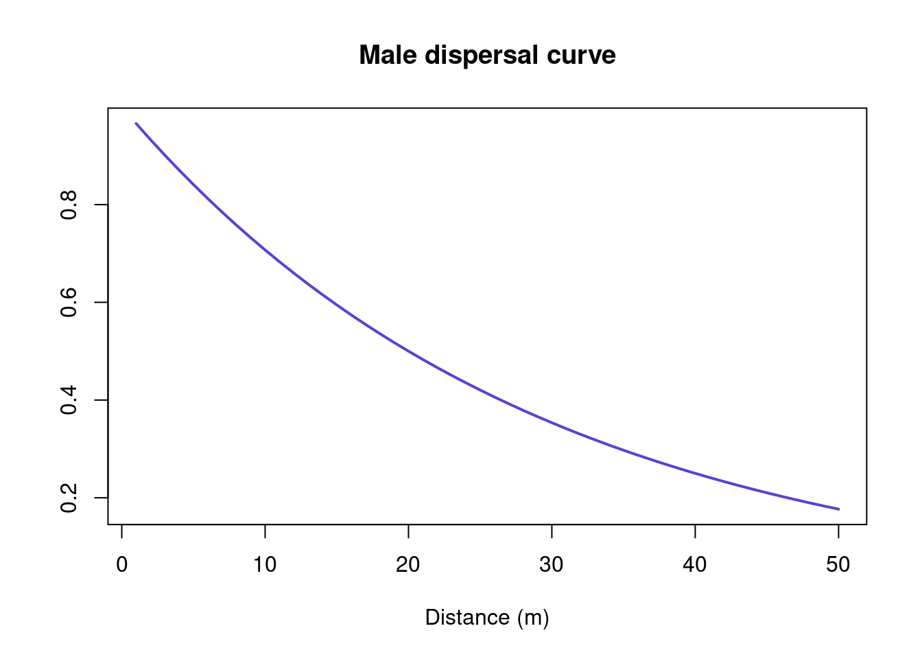
Next we’ll create a function that generates a population using glSim, which simulates simple SNP data and returns a genlight object. In our hypothetical population, females randomly mate with the nearest male, produce two offspring at a 50:50 sex-ratio, and the offspring then disperse following the dispersal probabilities created above.
# Create a function, where:
# Nind = number of individuals,
# Nsnp = number of SNPs,
# pdispF = female dispersal probability (generated above)
# pdispM = male dispersal probability (generated above)
# seed = set the seed so simulation is repeatable
SimDisp <-
function(Nind, Nsnp, pdispF, pdispM, seed) {
set.seed(seed)
# Simulate a genlight object
gg <- glSim(n.ind = Nind,
n.snp.nonstruc = Nsnp,
grp.size = c(0.999, 0.001),
ploidy = 2,
k=1,
LD=FALSE,
ind.names=paste(sprintf("ind%03d", 1:Nind), sep=""),
snp.names=paste(sprintf("snp%03d", 1:Nsnp), sep=""))
# Define pop
pop(gg) <- rep("A", Nind)
# Create all the other parameters
gg <- gl.compliance.check(gg)
# Define sex using a sex ratio of 0.5
ds <- c(rep("F", 0.5*Nind), rep("M", (1-0.5)*Nind))
ds <- ds[order(runif(length(ds)))]
gg@other$ind.metrics$sex <- factor(ds)
# Set coordinates
xy <- expand.grid(x=1:100, y=1:100)
# sample from the grid
xys <- xy[sample(1:nrow(xy), Nind, replace=FALSE),]
gg@other$ind.metrics$x <- xys$x
gg@other$ind.metrics$y <- xys$y
for (ii in 1:20) { # Run for 20 generations
# Find mating pairs & reproduce
females <- which(gg@other$ind.metrics$sex=="F")
males <- which(gg@other$ind.metrics$sex=="M")
off <-list()
for (i in 1:length(females)) {
mfemale <- gg[females[i],]
fxy <- c(gg@other$ind.metrics$x[females[i]],
gg@other$ind.metrics$y[females[i]])
mxy <- cbind(gg@other$ind.metrics$x[males],
gg@other$ind.metrics$y[males])
xxyy <- rbind(fxy, mxy)
# Find closest mating male
chosenm <- which.min(as.matrix(dist(xxyy))[1,-1])
mmale <- gg[males[chosenm],]
doff <- gl.sim.offspring(mmale,mfemale,sexratio = 0.5,
noffpermother = 2) # 2 offspring
doff@other$ind.metrics <- data.frame(sex =factor(c("F","M")),
x= mfemale@other$ind.metrics$x,
y = mfemale@other$ind.metrics$y)
off[[i]]<- doff
}
gg <- do.call(rbind, off)
# Make all offspring adults
xx <- (lapply(off, function(x) x@other$ind.metrics))
xx <- do.call(rbind, xx)
gg@other$ind.metrics <- xx
# Emigrate depending on dispersial distance
for (i in 1:nInd(gg)) {
# Use dispersal curves generated above to determine distance
if (gg@other$ind.metrics$sex[i]=="M") dis <-
max(which(runif(1)>pdispM)) else
dis=max(which(runif(1)>pdispF))
# Dispersal direction
dir <- runif(1,0,2*pi)
# Assign new coordinates
gg@other$ind.metrics$x[i] <- gg@other$ind.metrics$x[i] + dis*cos(dir)
gg@other$ind.metrics$y[i] <- gg@other$ind.metrics$y[i] + dis*sin(dir)
}
# Use torus to determine what to do with individuals that
# disperse outside of extent
gg@other$ind.metrics$x <- gg@other$ind.metrics$x %% 100
gg@other$ind.metrics$y <- gg@other$ind.metrics$y %% 100
# Plot
plot(gg@other$ind.metrics$x,
gg@other$ind.metrics$y,
pch=16, cex=1,
col=c('#E69F00', '#5D3FD3')[as.numeric(gg@other$ind.metrics$sex)],
asp=1,
main = paste("Generation", ii),
xlab = "x",
ylab = "y")
legend("bottomleft", legend=c("Female", "Male"),
col=c('#E69F00', '#5D3FD3'), pch = 16, cex= 1)
}
# Output genlight object containing simulated data
return(gg)
}Now run the function to simulate a population with 100 individuals, 1000 SNPs, and male-biased dispersal.
Tip
The simulation goes for 20 generations - you can see an animation below
simdat <-
SimDisp(Nind = 100,
Nsnp = 1000,
pdispF = pdispfemale,
pdispM = pdispmale,
seed = 123)
What does this mean for fine-scale genetic structure? Can we identify different dispersal patterns for males and females? Let’s run genetic spatial autocorrelation to find out. We’ll use the function gl.spatial.autoCorr. This is a multivariate approach that combines all loci into a single analysis (Smouse & Peakall 1999; Peakall et al. 2003; Banks & Peakall 2012). The autocorrelation coefficient “r” is calculated for each pair of individuals in each specified distance class (called “bins” in this function).
We’ll use evenly distributed bins and compare individuals at 10 m intervals up to 50 m.
Significance testing
There are two ways to test whether fine-scale genetic structure is significantly positive (i.e., individuals are genetically similar) or negative (i.e., individuals are genetically dissimilar).
The first approach is a one-tail permutation test, which provides 95% null hypothesis confidence regions. If the autocorrelation coefficient “r” falls outsdide of this range, significant fine-scale spatial genetic structure is present.
The second approach is to estimate 95% bootstrap confidence intervals (CIs) around the value for r. These are obtained by drawing (with replacement) from within the set of relevant pairwise comparisons for a given distance class. If bootstrap CIs do not overlap zero, fine-scale spatial genetic structure is present. Bootstrap CIs also allow you to test for significant differences between groups (e.g., between females and males). When CIs are non-overlapping, there is a significant difference.
I tend to use 95% bootstrap CIs, since they are more conservative than permutational tests and allow for comparisons. The gl.spatial.autoCorr function below will output 95% bootstrap CIs. You can try a permutation test by adding permutation = TRUE (note that for this option to work, you will need to create separate plots for each sex by choosing plot.pops.together = FALSE).
# Make 'sex' the population name
pop(simdat)<- simdat@other$ind.metrics$sex
# Add xy coordinates to the 'other' slot in genlight
simdat@other$latlon <- data.frame(lon = simdat@other$ind.metrics$x,
lat = simdat@other$ind.metrics$y)
simdat@other$latlon <- Mercator(simdat@other$latlon, inverse = T)
# Run genetic spatial autocorrelation
gl.spatial.autoCorr(simdat,
bins = seq(0, 50, 10),
plot.pops.together = TRUE,
plot.colors.pop = c('#E69F00', '#5D3FD3'))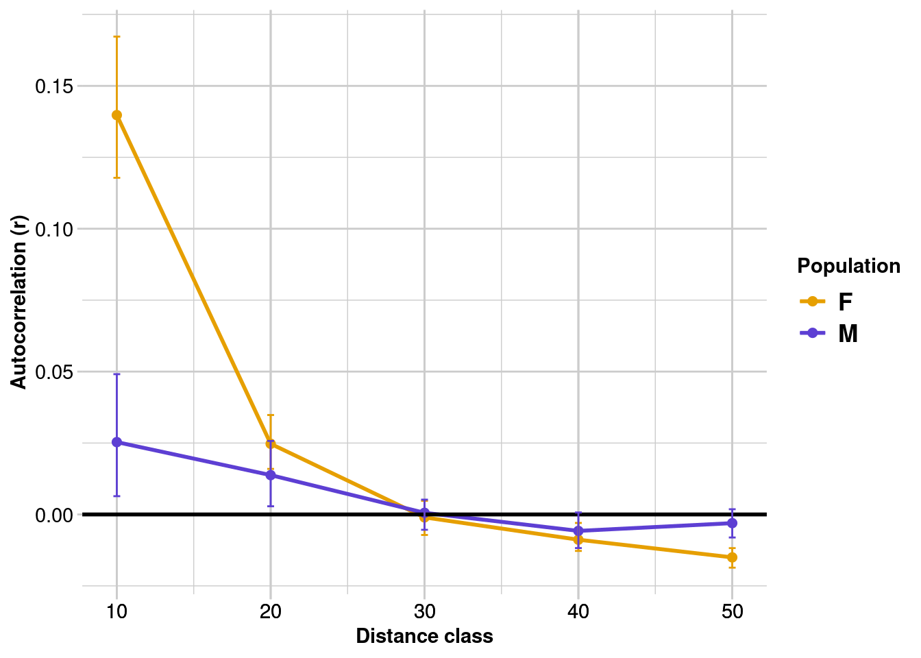
We can see that:
- Both females and males show significant positive spatial autocorrelation up to 30 m (where confidence intervals overlap zero). In other words, once you start comparing individuals that are 30 m apart, they are unlikely to be related/genetically similar (regardless of sex).
- Females have significantly stronger fine-scale genetic structure than males up to 10 m (i.e., a greater “r” value and female and male bootstrap CIs are non-overlapping).
These results are not surprising, since we set our distance classes based on the known (simulated) dispersal capacity of males and females, and we had large sample sizes (both individuals and loci). In reality, this analysis is a careful balance between power (maximising the sample size in each bin), and ensuring you are looking at the right scale (i.e., the size of the distance class matches the extent of spatial-genetic structure).
Exercise
What happens when you vary the dispersal distances? Can you pick up small differences between the sexes?
What happens if you change the number of individuals or SNPs? Does this influence the sensitivity of the analysis? Which is more important - more individuals or more loci?
What happens when you vary the size and number of distance classes? How does this interact with sample size? What do you think would happen if you used a single 50 m distance class - do we still see the signal of male-biased dispersal?
Re-run the code from the beginning
Try varying the following parameters:
Dispersal curves: “d0” and “p” when running the
p2pfunctionSample sizes: “Nind” (number of individuals) and “Nsnp” (number of loci) when running the
SimDispfunctionDistance classes: “bins” when running the
gl.spatial.autoCorrfunction
2. Isolation-by-distance
Isolation-by-distance (IBD) is a key concept in population genetics. It describes a simple idea: that geographic distance can influence gene flow because individuals or populations that are geographically distant from each other are less likely to share genetic material than those that are close (based on the “stepping-stone” model; Kimura & Weiss 1964).
We can test for IBD with Mantel tests of matrix correspondence (Mantel 1967), implemented using the function gl.ibd. This test compares pairwise geographic and genetic distance matrices, using permutations to test for significance. For the latter, you can use pairwise estimates of population differentiation or individual-by-individual genetic distances.
It’s easy enough to plot the relationship between geographic and genetic distance. However, we can’t use a standard regression to test this relationship because pairwise data are not independent. Mantel tests solve this problem by using permutation to test for significance (e.g., the data are randomly shuffled. The result will be similar to the shuffled outcome if there is no relationship present).
Populations vs. individuals
IBD tests often use pairwise population metrics like FST. This is useful when there are lots of samples and populations are well defined. However, there are often situations where we don’t have multiple samples per location, populations are difficult to define and/or individuals are more continuously distributed. In this case, we can use the individual as the unit of analysis.
Where FST estimates represent evolutionary averages, pairwise individual genetic distances may represent more contemporary patterns of dispersal. Therefore, the approach you take depends on the species, your sampling, and the question you want to ask.
Let’s test for IBD in our simulated data set:
total.ibd <- gl.ibd(simdat, distance="euclidean", coordinates= 'latlon')
# Show Mantel statistics
total.ibd$mantel
Mantel statistic based on Pearson's product-moment correlation
Call:
vegan::mantel(xdis = Dgen, ydis = Dgeo, permutations = permutations, na.rm = TRUE)
Mantel statistic r: 0.08552
Significance: 0.013
Upper quantiles of permutations (null model):
90% 95% 97.5% 99%
0.0512 0.0634 0.0767 0.0866
Permutation: free
Number of permutations: 999There is significant IBD across all individuals, but it’s not very pronounced. Can we still see the signal of male-biased dispersal? Let’s create separate IBD plots for females and males:
f.ibd <- gl.ibd(simdat[simdat@pop == "F"], distance="euclidean", coordinates= 'latlon')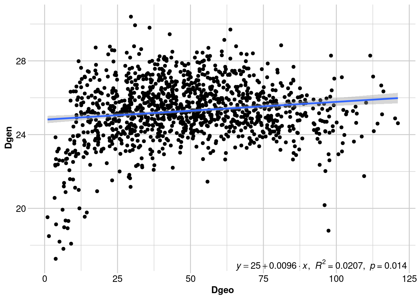
m.ibd <- gl.ibd(simdat[simdat@pop == "M"], distance="euclidean", coordinates= 'latlon')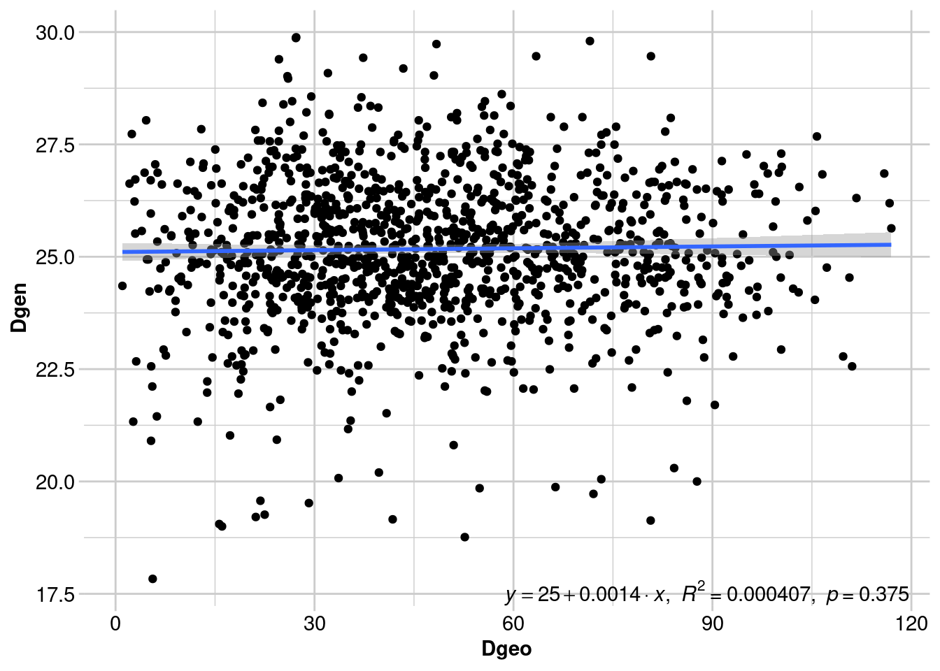
# Show Mantel statistics for females
f.ibd$mantel
Mantel statistic based on Pearson's product-moment correlation
Call:
vegan::mantel(xdis = Dgen, ydis = Dgeo, permutations = permutations, na.rm = TRUE)
Mantel statistic r: 0.1438
Significance: 0.014
Upper quantiles of permutations (null model):
90% 95% 97.5% 99%
0.0828 0.1053 0.1302 0.1476
Permutation: free
Number of permutations: 999# Show Mantel statistics for males
m.ibd$mantel
Mantel statistic based on Pearson's product-moment correlation
Call:
vegan::mantel(xdis = Dgen, ydis = Dgeo, permutations = permutations, na.rm = TRUE)
Mantel statistic r: 0.02018
Significance: 0.375
Upper quantiles of permutations (null model):
90% 95% 97.5% 99%
0.0825 0.1027 0.1199 0.1514
Permutation: free
Number of permutations: 999
Mantel test statistics
Although a regression line is useful for visualising the relationship between geographic and genetic distance, we don’t report the results of the regression (for reasons outlined above). Instead, we report the Mantel test statistic (and the p-value), which is the correlation between the two distance matrices. Values that approach -1 indicate a strong negative relationship, values close to 0 suggest there is no relationship, and values approaching +1 indicate a strong positive relationship (i.e., IBD).
Above we can see that there is significant IBD in females, since dispersal is more restricted. Males show no pattern of IBD, since many individuals can disperse right up to the spatial extent of our sampling. However, we lose some of the nuance from the previous analysis.
What can we learn from each analysis?
Mantel tests show us the broad trend across our study. IBD often acts as our null hypothesis (along with panmixia - i.e., random mating and dispersal) against which to test further landscape genetic analyses. However, unless the signal of sex-biased dispersal is very strong across the whole dataset, a Mantel test is unlikely to detect it. Spatial autocorrelation analysis is usually more powerful in detecting fine-scale genetic patterns than Mantel tests, because samples are “binned” and genetic structure is explored across multiple distance classes.
Exercise
- What happens if you use the proportion of shared alleles instead of euclidean distance?
We expect a linear relationship between geographic distance (sometimes log-transformed) and genetic distance. A discontinuous relationship can be an indication that something else is going on. We will explore this idea below using a real example.
Lesser hairy-footed dunnarts in the Pilbara

Load the data
load('data/Sy.gl.RData') # genetic dataSminthopsis youngsonii (or the lesser hairy footed dunnart), is a small carnivorous dasyurid found across the Australian arid region. As the name suggests, their hind foot is covered in short, bristly hairs, which are thought to help them move on sandy soils. They are usually found on sand dunes, inter dune swale and red sand plains.
These samples were taken in the Pilbara region at the very western edge of their range. Let’s take a look at a map:
leaflet(Sy.gl@other$latlong) %>%
addTiles() %>%
addCircleMarkers(lng = ~lon, lat = ~lat,
popup = ~htmlEscape(lon))Given this is the edge of their range, and the Pilbara is quite rocky and doesn’t harbour much of the ideal habitat for this species, we want to know a little more about dispersal and connectivity in this area. A good first step is to test for isolation by distance.
Sy.ibd <- gl.ibd(Sy.gl, distance="euclidean")
# Show Mantel statistics
Sy.ibd$mantel
Mantel statistic based on Pearson's product-moment correlation
Call:
vegan::mantel(xdis = Dgen, ydis = Dgeo, permutations = permutations, na.rm = TRUE)
Mantel statistic r: 0.6513
Significance: 0.001
Upper quantiles of permutations (null model):
90% 95% 97.5% 99%
0.0613 0.0897 0.1204 0.1594
Permutation: free
Number of permutations: 999Yes - there is significant IBD! The pattern is very strong. But… some of the points don’t seem to follow the same slope? Why might this be?
There seems to be a big gap in sampling. This could be due to a sampling bias (e.g., the missing area is difficult to get to). Alternatively, the species may not occur here, suggesting there might be something going on with the habitat.
Given what we know about the species, what would be a reasonable hypothesis?
Could substrate be driving this sampling gap and the strange IBD pattern?
Let’s separate the individuals into two populations using longitude. You can click on the points in the map above to choose a location.
# Choose a point that separates the samples into two populations
lon.break <- 114.87
# Assign eastern and western populations based on this point
Sy.gl@pop <- as.factor(ifelse(Sy.gl@other$latlong$lon < lon.break, "1.West", "2.East"))Now let’s take another look at IBD, but this time we’ll include the population information.
gl.ibd(Sy.gl, distance = "euclidean", paircols = 'pop')
It looks like the magnitude of genetic distance is different and there are two different slopes describing IBD within each ‘population’. The points with large geographic and genetic distances represent among population comparisons. Discontinuities like this can sometimes suggest a barrier to gene flow. Let’s take a look at the substrate.
# Load a soil shapefile
soil <- st_read("./data/Soil.shp") # spatial data
# Create a colour palette for the two populations
pop.pal <- colorFactor(
palette = c("#F8766D", "#00BFC4"),
domain = Sy.gl@pop
)
# Create a palette
soil.pal <- colorFactor(
palette = c("#9C640C",
"#5c3001",
"#C0392B",
"#EDC001",
"#FDEFB2"),
domain = soil$Type
)# Generate another map
leaflet(cbind(pop = Sy.gl@pop, Sy.gl@other$latlong)) %>%
addTiles() %>%
addPolygons(data=soil, weight = 0, fillOpacity = 0.7,
color = ~soil.pal(Type)) %>%
addCircleMarkers(lng = ~lon, lat = ~lat,
color = ~pop.pal(pop)) %>%
addLegendFactor(pal = soil.pal, shape = 'rect', fillOpacity = .7,
opacity = 0, values = ~soil$Type, title = 'Soil type',
position = 'topright', data = gadmCHE, group = 'Polygons')It looks like clay could be acting as a barrier. This is a good theory, but it would be useful to be able to visualise these patterns of isolation by distance spatially to get an indication of where gene flow is being restricted. We’ll explore this idea in the next section.
3. EEMS
Visualise the effect of landscape features on gene flow (dispersal) using EEMS
EEMS (Estimated Effective Migration Surfaces) is a fairly new method introduced to visualize and infer patterns of historical gene flow across geographical spaces Petkova, Novembre, and Stephens (2016). This method offers a novel approach to understanding how populations have migrated, mixed, and been isolated from each other over time, based on genetic data. EEMS lays a triangular mesh over the study area and estimates the effective migration rate between each pair of vertices. The effective migration rate is a measure of the rate of gene flow between two populations, and is a function of the geographic distance between them, as well as the resistance to gene flow imposed by the landscape. The effective migration rate is estimated by comparing the genetic differentiation between populations to the geographic distance between them, and is used to infer the strength of gene flow between populations. The EEMS method is based on a Bayesian model, and the effective migration rate is estimated using a Markov Chain Monte Carlo (MCMC) algorithm. The run the EEMS method you need to have the reemsplot2 package installed, which is only provided via github:
devtools::install_github("dipetkov/reemsplots2")In addition you need to provide the path to the EEMS executable (binaries for Windows and Linux are available in the binaries folder). Good news all is set up within the rstudio cloud
So a typical run of EEMS would look like this (please be aware the suggested number of interations are numMCMCIter = 8000000, so this is just to show how to run EEMS):
#eems.path <- "d:/downloads/eems"
eems.path <- "./binaries/"
eems <- gl.run.eems(Sy.gl, buffer = 1000, eems.path =eems.path, nDemes = 50, diploid = TRUE,
numMCMCIter = 10000, numThinIter = 99, numBurnIter = 5000, add_demes=TRUE,
add_grid=TRUE, out.dir=tempdir())Starting gl.run.eems 
Warning: `as_data_frame()` was deprecated in tibble 2.0.0.
ℹ Please use `as_tibble()` (with slightly different semantics) to convert to a
tibble, or `as.data.frame()` to convert to a data frame.
ℹ The deprecated feature was likely used in the reemsplots2 package.
Please report the issue at <https://github.com/dipetkov/eems/issues>.Warning: The `x` argument of `as_tibble.matrix()` must have unique column names if
`.name_repair` is omitted as of tibble 2.0.0.
ℹ Using compatibility `.name_repair`.
ℹ The deprecated feature was likely used in the tibble package.
Please report the issue at <https://github.com/tidyverse/tibble/issues>.Warning: `data_frame()` was deprecated in tibble 1.1.0.
ℹ Please use `tibble()` instead.
ℹ The deprecated feature was likely used in the reemsplots2 package.
Please report the issue at <https://github.com/dipetkov/eems/issues>.Joining with `by = join_by(id)`
New names:
Generate effective migration surface (posterior mean of m rates). See
plots$mrates01 and plots$mrates02.
Generate effective diversity surface (posterior mean of q rates). See
plots$qrates01 and plots$qrates02.
Generate average dissimilarities within and between demes. See plots$rdist01,
plots$rdist02 and plots$rdist03.
Generate posterior probability trace. See plots$pilog01.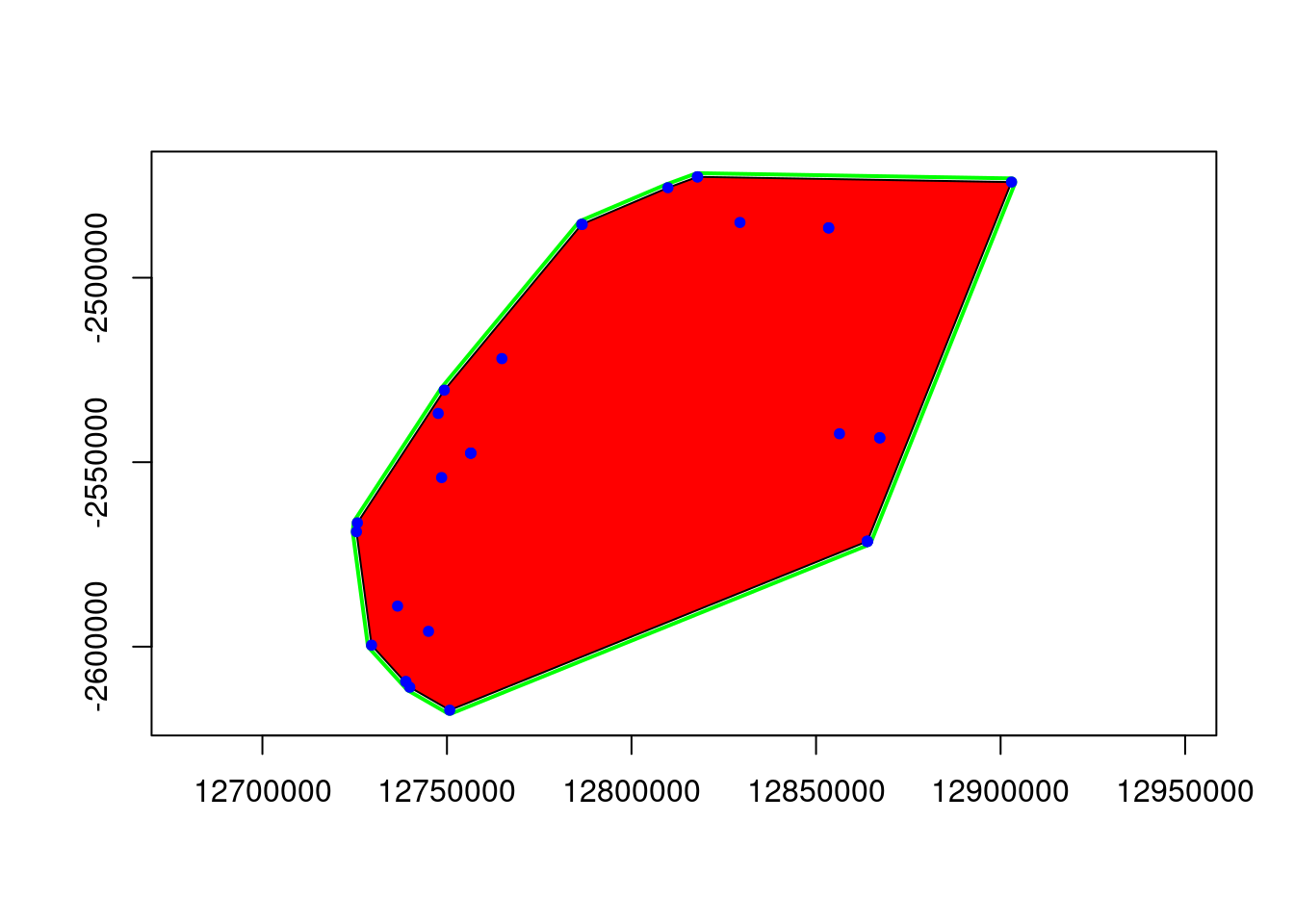
ggplot object saved as RDS binary to /tmp/Rtmpzh3mAi/eems.RDS using saveRDS()Looking at the input parameters you might find the nDemes parameter to have to be explained. The nDemes is the number of demes (or vertices) in the triangular mesh that is laid over the study area. The number of demes is a critical parameter, as it determines the resolution of the EEMS plot. A higher number of demes will result in a finer resolution, but will also require more computational time. The number of demes should be chosen based on the size of the study area, the number of populations, and the amount of genetic data available. Unfortunately the EEMS method does not allow to check the grid and the placement of demes before it is finished. My approach is therefore to run the EEMS method with a low number of iterations, simply to check the demes and its placement. Once the demes seems to be set appropriately I run the full method.
Checking the demes
eems <- gl.run.eems(Sy.gl, eems.path =eems.path, nDemes = 200, diploid = TRUE,
numMCMCIter = 10000, numThinIter = 99, numBurnIter = 5000, add_demes=TRUE,
add_grid=TRUE)Starting gl.run.eems 
Joining with `by = join_by(id)`
New names:
Generate effective migration surface (posterior mean of m rates). See
plots$mrates01 and plots$mrates02.
Generate effective diversity surface (posterior mean of q rates). See
plots$qrates01 and plots$qrates02.
Generate average dissimilarities within and between demes. See plots$rdist01,
plots$rdist02 and plots$rdist03.
Generate posterior probability trace. See plots$pilog01.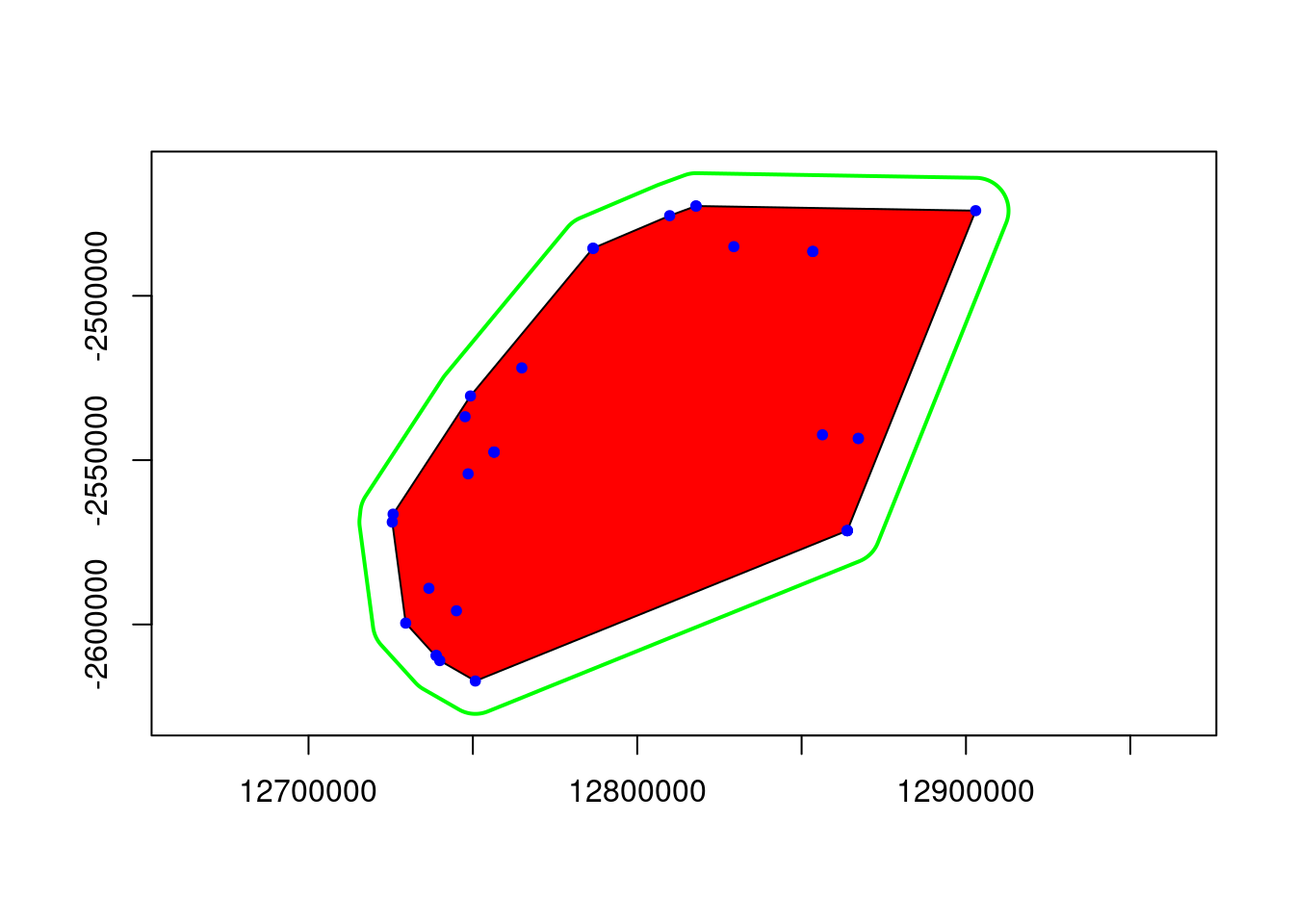
ggplot object saved as RDS binary to /tmp/Rtmpzh3mAi/eems.RDS using saveRDS()In case you are wondering, the gl.run.eems functions reprojects your points to a planar coordinate system (Mercator as used by google maps), so you don’t have to worry about the projection of your data and distances are in meters. But this has the “trouble” that you no longer have latlongs as your coordinate system. The benefit is that we can simply use leaflet package to visualise the data afterwards. We simply hack our genlight object in the sense that we add the Mercator data to a new xy slot.
Sy.gl@other$xy <- data.frame(dismo::Mercator(Sy.gl@other$latlong[,2:1]))Then we can plot the demes and the grid to check if the demes are set appropriately.
eems[[1]]+coord_equal()+geom_point(data=Sy.gl@other$xy, aes(x=x, y=y), pch=16)Coordinate system already present. Adding new coordinate system, which will
replace the existing one.Warning: The `guide` argument in `scale_*()` cannot be `FALSE`. This was deprecated in
ggplot2 3.3.4.
ℹ Please use "none" instead.
ℹ The deprecated feature was likely used in the reemsplots2 package.
Please report the issue at <https://github.com/dipetkov/eems/issues>.Warning: Removed 14 rows containing missing values or values outside the scale range
(`geom_tile()`).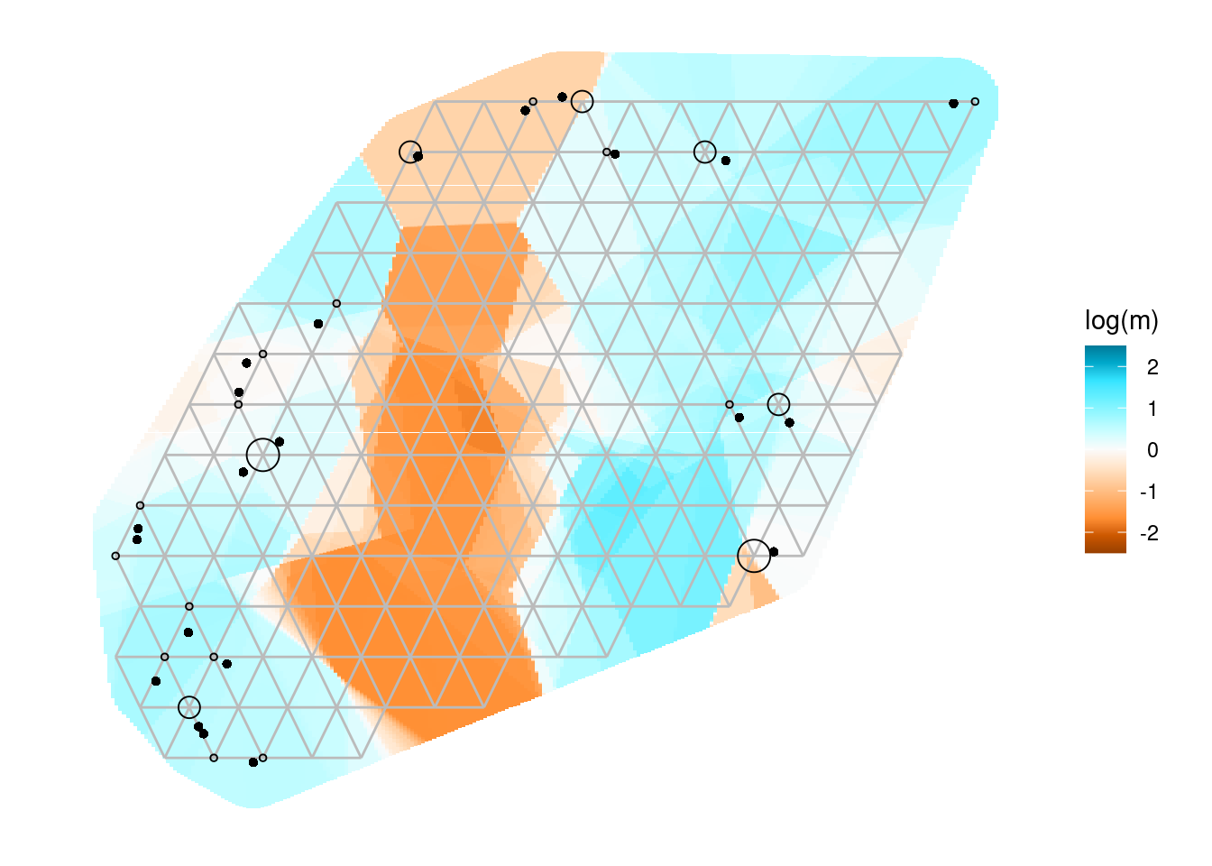
The bigger open circles are the demes that EEMS will use to estimate the migration rates and the smaller black dots are you genetic samples.
Exercise
![]() Change the number of ndemes and see how this affects the grid placement and number of demes.
Change the number of ndemes and see how this affects the grid placement and number of demes.
eems <- gl.run.eems(Sy.gl, eems.path =eems.path, nDemes = 200, diploid = TRUE,
numMCMCIter = 10000, numThinIter = 99, numBurnIter = 5000, add_demes=TRUE,
add_grid=TRUE)
eems[[1]]+coord_equal()+geom_point(data=Sy.gl@other$xy, aes(x=x, y=y), pch=16)Then I run the full method. Petkova, Novembre, and Stephens (2016) also recommends to run it with 8 Mio iterations and the burnin to be 2 Mio interations. Finally it recommends to run the whole procedure 3 times with different seed settings (If you do not specify the seed, then a random seed is chosen.)
eems <- gl.run.eems(Sy.gl, eems.path =eems.path, nDemes =50, diploid = TRUE,
numMCMCIter = 10000, numThinIter = 99, numBurnIter = 5000, add_demes=TRUE,
add_grid=TRUE, out.dir=tempdir())Plot the EEMS results on a map
Before we go into the evaluation andinterpretation of our EEMS runs we want to be able to create a map that shows the results within a landscape context.
r <- raster::rasterFromXYZ(eems[[1]]$data) #create a raster from the EEMS results map 1
#define Mercator projection
crs(r) <- "+proj=merc +a=6378137 +b=6378137 +lat_ts=0.0 +lon_0=0.0 +x_0=0.0 +y_0=0 +k=1.0 +units=m +nadgrids=@null +no_defs"
gl.map.interactive(Sy.gl, provider = "Esri.WorldShadedRelief") %>% addRasterImage(r, opacity = 0.5) Starting gl.map.interactive
Processing genlight object with SNP data
Completed: gl.map.interactive #in case you are interested you can also add the soil polygons
#a bit hard to see but the clay overlaps quite well with the high resistance areas
gl.map.interactive(Sy.gl, provider = "Esri.WorldShadedRelief")%>% addPolygons(data=soil, weight = 0, fillOpacity = 0.7, color = ~soil.pal(Type)) %>% addRasterImage(r, opacity = 0.5) Starting gl.map.interactive
Processing genlight object with SNP data
Completed: gl.map.interactive Evaluation of the EEMS results
To avoid a long waiting time we simply load a longer EEMS run (default settings) using the same data.
eems.comp <- readRDS("data/eems_comp.rds")We have not looked at all of the output. There are actually 8 figures that are produced by the EEMS method. You can access the using the notation eems.comp[[1]] or eems.comp$mrates01.
| Plot | Description |
|---|---|
mrates01 |
Effective migration surface. This contour plot visualizes the estimated effective migration rates (m), on the log10 scale after mean centering. |
mrates02 |
Posterior probability contours (\(P(\log(m) > 0) = p\)) and (\(P(\log(m) < 0) = p\)) for the given probability level (p). Since migration rates are visualized on the log10 scale after mean centering, 0 corresponds to the overall mean migration rate. This contour plot emphasizes regions with effective migration that is significantly higher/lower than the overall average. |
qrates01 |
Effective diversity surface. This contour plot visualizes the estimated effective diversity rates (q), on the log10 scale after mean centering. |
qrates02 |
Posterior probability contours (\(P(\log(q) > 0) = p\)) and (\(P(\log(q) < 0) = p\)). Similar to mrates02 but applied to the effective diversity rates. |
rdist01 |
Scatter plot of the observed vs the fitted between-deme component of genetic dissimilarity, where one point represents a pair of sampled demes. |
rdist02 |
Scatter plot of the observed vs the fitted within-deme component of genetic dissimilarity, where one point represents a sampled deme. |
rdist03 |
Scatter plot of observed genetic dissimilarities between demes vs observed geographic distances between demes. |
pilogl01 |
Posterior probability trace. |
Exercise
![]() Have a look at all the plot and try to understand what they are showing.
Have a look at all the plot and try to understand what they are showing.
The plot that are most often shown (and probably most interesting) are the mrates plots as they demonstrate the migration pattern across the landscape. The simply differ in the way how they threshold the migration rates (basically how they color them) Plot 3 and 4 are about the second important feature, which is the “diversity” across the landscape. Plot 5 and 6 demontrate the relationship between observerd and fitted between and within demes dissimilarity. In short they should show a linear relationship (the more linear the better is the model fit). Plot 7 shows the relationship between genetic and geographic distance. If the genetic distance increases with geographic distance, then there is a pattern of isolation by distance (IBD). Plot 8 shows the convergence of MCMC chain (should stabilise towards similar valus if run multiple times).
4. Isolation-by-resistance
Up to this point, we’ve tested for IBD - but have not tested for an effect of the landscape on gene flow. We can do that using the genleastcost function in the gdistance package. This function calculates the least cost path between all pairs of demes and then calculates the correlation between the genetic distance and the least cost path distance.
To be able to run an isolation-by-barrier analysis, we need to have a raster that represents the resistance to gene flow. This can be a resistance surface that is based on the landscape features (e.g. land cover, elevation, soil type, etc.). As we have a good indication that the soil type clay might be a barrier (and sand might be a facilitator) we will use the soil type raster as a resistance surface. To do so some GIS jumble is needed, namely we need to create a raster that covers the area, and code resistance values for the different soil types.
# create a template raster
template = rast(vect(soil),res=0.005)
#convert soil (vector) to raster
soil_raster <- rasterize(vect(soil), template,"Type")
plot(soil_raster)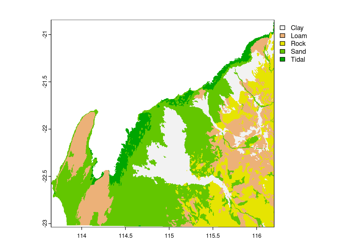
The next step is to convert the raster to the Mercator projection, then crop it to the extent of the study area, and finally resample it to a coarser resolution (to make the analysis faster).
#project raster to Mercator (using r from above)
soil_raster.merc <- project(soil_raster, crs(r))Warning: [project,SpatRaster] argument y (the crs) should be a character value#crop raster to extent of the study area
soil.raster.merc.crop <-raster(crop(soil_raster.merc, extent(r)))
#resample to 500 meters (to make it faster)
template2 <- raster(extent(soil.raster.merc.crop), resolution=1000)
soil.final <- resample(soil.raster.merc.crop, template2, method="ngb")
plot(soil.final)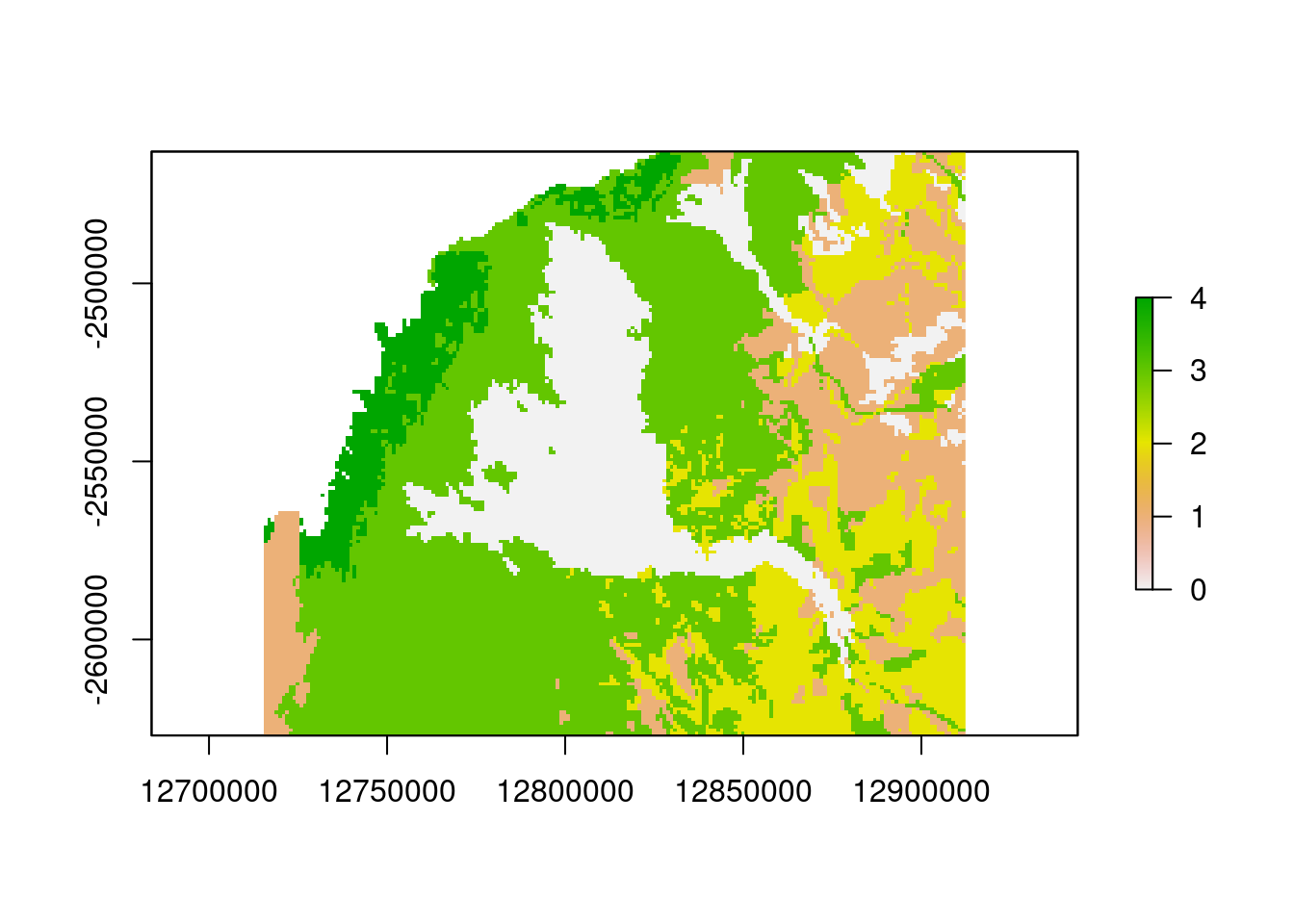
soil.finalclass : RasterLayer
dimensions : 164, 197, 32308 (nrow, ncol, ncell)
resolution : 1000, 1000 (x, y)
extent : 12715387, 12912387, -2626974, -2462974 (xmin, xmax, ymin, ymax)
crs : NA
source : memory
names : Type
values : 0, 4 (min, max)table(values(soil.final))
0 1 2 3 4
5331 4416 4301 12027 1670 Great the final step is the recoding of the resistance values. From the first plot and using our knowlegde on the terrain colors in R, we can see that the soil type “clay” is coded as 0, “loam” as 1, “rock” as 2, “sand” as 3, and “tidal” as 4. We have to recode those values to be able to use it as a resistance surface.
This is actually a step that has potentially a lot of effect and there is not really a good way to give advice as the recoding can be very specific. For a binary resistance surface (e.g. a river or road) it is fairly easy, but the absolute values to use is not really clear. E.g. linear structures like roads are fairly thin, hence they need a high resistance value to have an effect. in contrast layers such as the soil layer, lower values are more appropriate as individual cells are not barriers but the overall area is. Then there are contineous layers such as elevation and here a “mapping” function is needed. E.g. is the effect meant to be linear or is it more like a limiting curve (e.g. from a certain elevation the resistance becomes not much higher. Also step functions might be a good idea. As a general rule how to decide on the recoding it is important to think about the feature that is meant to be a barrier and how it expected to affect the migration of individuals.
#convert resistance values
# clay =0, loam =1, rock = 2, sand =3, tidal =4
#clay only
res.clay <- soil.final
res.clay[res.clay==0] <- 20
res.clay[res.clay<20] <- 1
res.clay[is.nan(res.clay)] <- 50
names(res.clay)<- "Clay20"
plot(res.clay)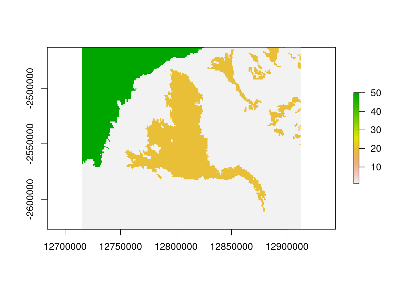
#exercise test if sand only is better
#sand onlyNow we can run the isolation-by-resistance analysis. We will use the leastcost function to calculate the least cost path between all pairs of demes. Then we will use the wassermann function to calculate the correlation between the genetic distance and the least cost path distance and correct for Euclidean distance (and vice versa).
#takes about a minute to run
system.time( glc.clay<- gl.genleastcost(Sy.gl, fric.raster = res.clay,
gen.distance = "dist", NN=8,
pathtype = "leastcost"))Starting gl.genleastcost 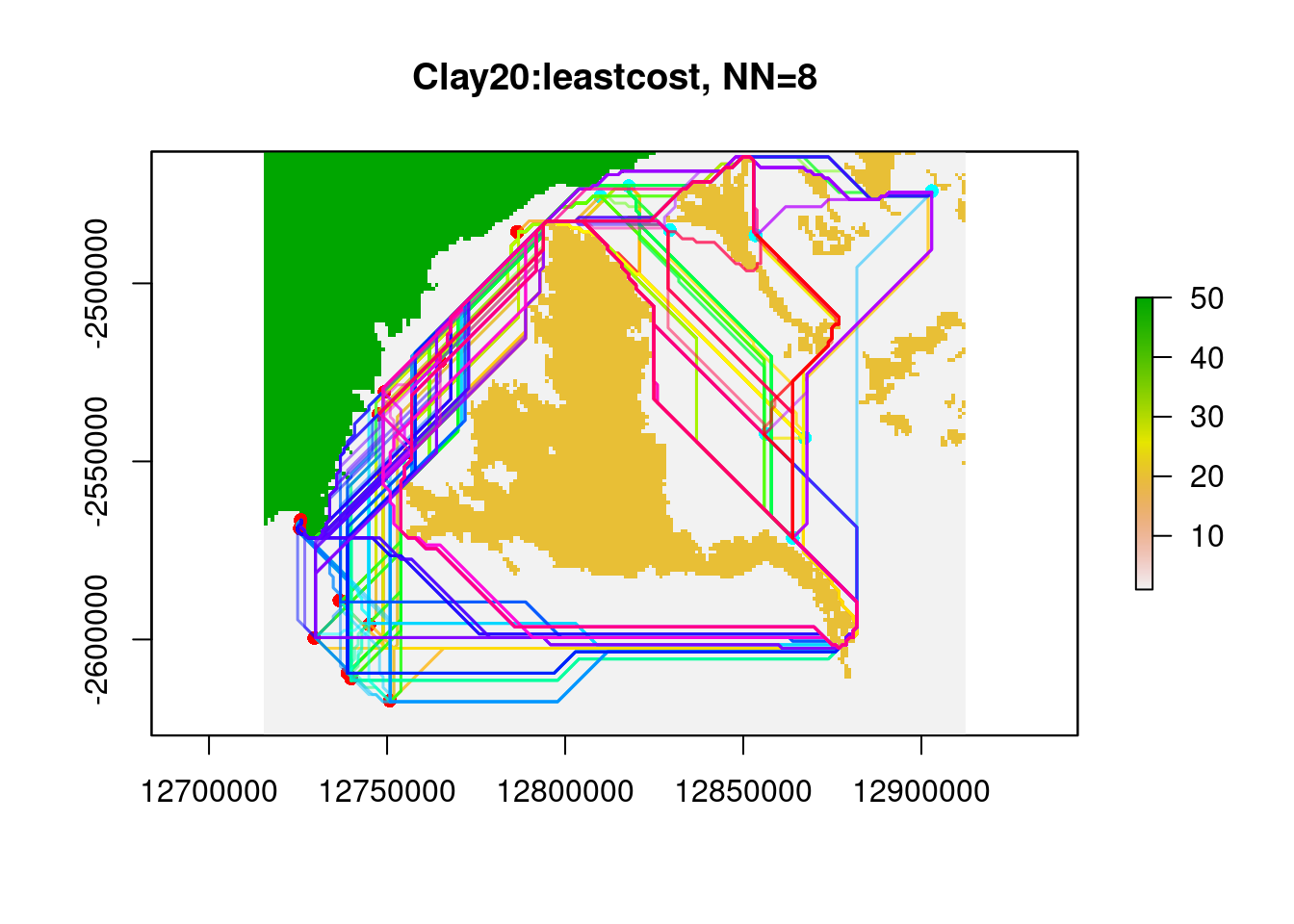
Completed: gl.genleastcost user system elapsed
26.048 0.219 26.268 PopGenReport::wassermann(eucl.mat = glc.clay$eucl.mat,
cost.mat = glc.clay$cost.mats,
gen.mat = glc.clay$gen.mat, plot = FALSE)Registered S3 method overwritten by 'genetics':
method from
[.haplotype pegas$mantel.tab
model r p
1 Gen ~Clay20 | Euclidean 0.242 0.001
2 Gen ~Euclidean | Clay20 0.0262 0.339And voila the results is as we hoped (the effect of clay is a significanct when corrected by Euclidean distance and the effect of Eucledian distance when corrected for Clay is not).
Be aware this is just a quick example, hence we only used 1000 loci and 30 individuals. A full analysis would require more loci and individuals. Also to have a valid resistance surface, we would need to check the correlation between the least cost distance matrix and the Euclidean distance matrix. If the leastcost matrix does correlate too closely with the Euclidean distance matrix (e.g. r>0.7) then I would be very careful with my interpretation.
Lets check that quickly
Alldis <- list(GDis = glc.clay$gen.mat,
Edis = glc.clay$eucl.mat,
CD.clay =glc.clay$cost.mats[[1]])
df <- data.frame(lapply(Alldis, lower))
ggpairs(df[,3:1]) #reverse order so GDis is on the y-axis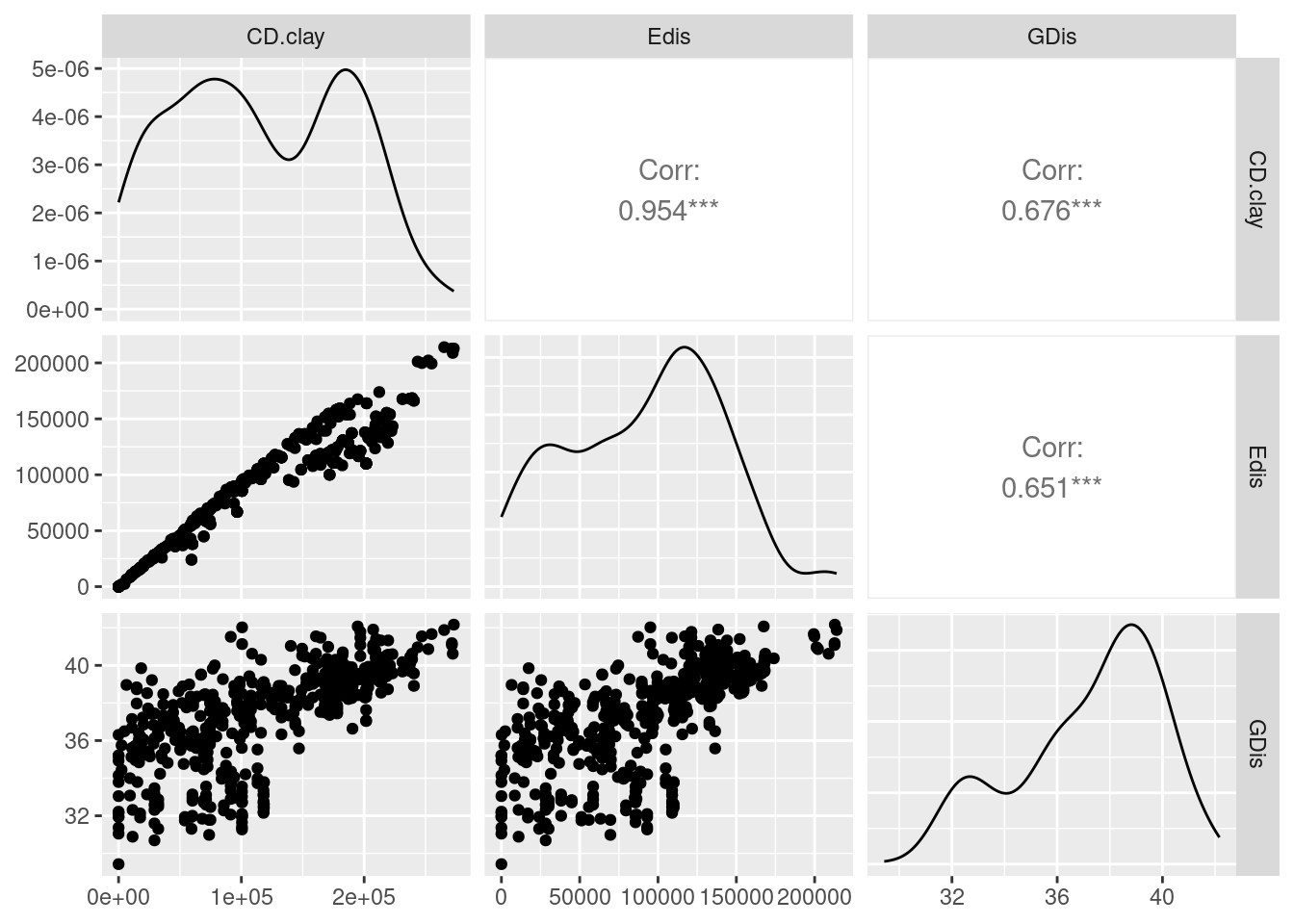
As you can see the correlation between Edis and CD.clay is >0.95, hence they are basically inseperable hence I would not trust the results. Nevertheless we test our next hypothesis, that sand is a facilitator of gene flow.
#maybe best
#clay and sand
#clay only
res.sand <- soil.final
res.sand[res.sand!=3] <- 10
res.sand[res.sand==3] <- 1
res.sand[is.nan(res.sand)] <- 50
system.time(glc.sand <- gl.genleastcost(Sy.gl, fric.raster = res.sand, "propShared", NN=8,
pathtype = "leastcost"))Starting gl.genleastcost 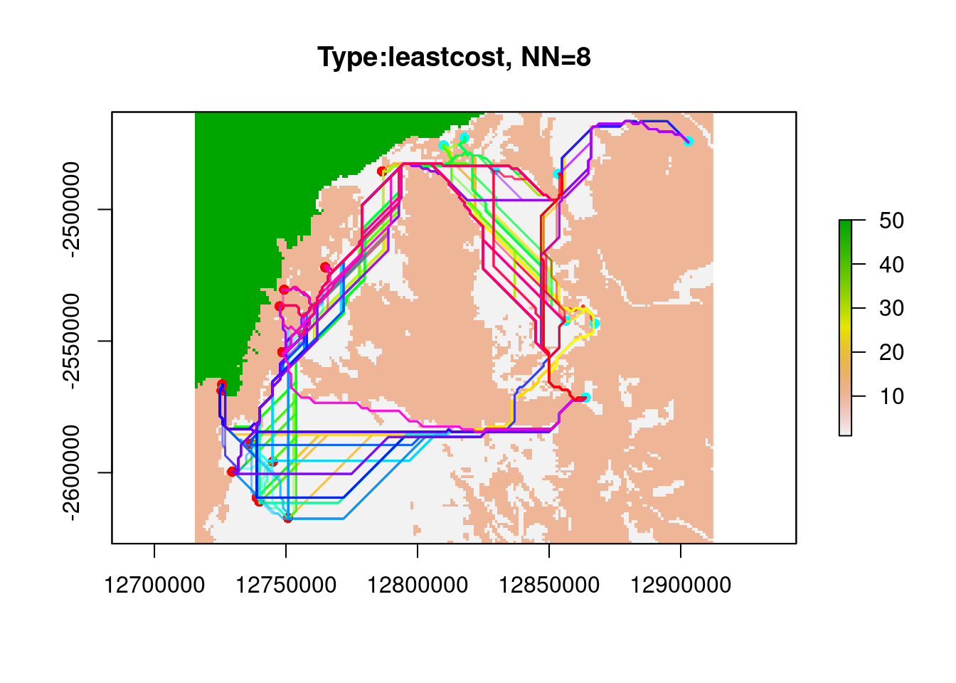
Completed: gl.genleastcost user system elapsed
25.481 0.117 25.576 PopGenReport::wassermann(eucl.mat = glc.sand$eucl.mat, cost.mat = glc.sand$cost.mats,
gen.mat = glc.sand$gen.mat,plot = FALSE)$mantel.tab
model r p
2 Gen ~Euclidean | Type -0.3765 1
1 Gen ~Type | Euclidean -0.1068 0.879Finally it would be great to have an approach to test both layers within on Framework. To do so Clarke et al. (2002) proposed a method to test the effect of multiple layers on the genetic distance [maximum likelihood population effects mixed effects model (MLPE)]. It allows to test different hypothesis by running the differnt models and compare them using AIC values.
#clay and sand
Alldis <- list(GDis = glc.clay$gen.mat,
Edis = glc.clay$eucl.mat,
CD.clay =glc.clay$cost.mats[[1]],
CD.sand = glc.sand$cost.mats[[1]])
ids <- To.From.ID(nInd(Sy.gl))
df <- data.frame(lapply(Alldis, lower))
names(df)[1] "GDis" "Edis" "CD.clay" "CD.sand"df <- data.frame(scale(df))
df$pop <- ids$pop1Now we can run the MLPE model and compare the AIC values to see which model is the best.
mlpe.full <- mlpe_rga(formula = GDis ~ Edis+ CD.clay + CD.sand +(1|pop), data=df)
summary(mlpe.full)Linear mixed model fit by maximum likelihood ['lmerMod']
AIC BIC logLik deviance df.resid
705.8 731.1 -346.9 693.8 490
Scaled residuals:
Min 1Q Median 3Q Max
-2.92415 -0.61207 0.05553 0.71620 2.56811
Random effects:
Groups Name Variance Std.Dev.
pop (Intercept) 0.2046 0.4524
Residual 0.1888 0.4345
Number of obs: 496, groups: pop, 32
Fixed effects:
Estimate Std. Error t value
(Intercept) 3.905e-15 1.611e-01 0.000
Edis -3.159e-01 8.708e-02 -3.628
CD.clay 8.652e-01 1.222e-01 7.079
CD.sand 3.615e-01 1.246e-01 2.901
Correlation of Fixed Effects:
(Intr) Edis CD.cly
Edis 0.000
CD.clay 0.000 -0.669
CD.sand 0.000 -0.024 -0.708AIC(mlpe.full)[1] 705.8445mlpe.clay <- mlpe_rga(formula = GDis ~ Edis+ CD.clay +(1|pop), data=df)
AIC(mlpe.clay)[1] 712.1448mlpe.sand <- mlpe_rga(formula = GDis ~ Edis+ CD.sand +(1|pop), data=df)
AIC(mlpe.sand)[1] 748.3654mlpe.euc <- mlpe_rga(formula = GDis ~ Edis +(1|pop), data=df)
summary(mlpe.euc)Linear mixed model fit by maximum likelihood ['lmerMod']
AIC BIC logLik deviance df.resid
848.8 865.7 -420.4 840.8 492
Scaled residuals:
Min 1Q Median 3Q Max
-3.0923 -0.5349 0.1700 0.6267 3.1027
Random effects:
Groups Name Variance Std.Dev.
pop (Intercept) 0.1697 0.4120
Residual 0.2622 0.5121
Number of obs: 496, groups: pop, 32
Fixed effects:
Estimate Std. Error t value
(Intercept) 1.218e-16 1.475e-01 0.00
Edis 7.790e-01 2.468e-02 31.56
Correlation of Fixed Effects:
(Intr)
Edis 0.000 AIC(mlpe.full)[1] 705.8445AIC(mlpe.full, mlpe.clay, mlpe.sand, mlpe.euc) df AIC
mlpe.full 6 705.8445
mlpe.clay 5 712.1448
mlpe.sand 5 748.3654
mlpe.euc 4 848.8412In this case the MPLE selects the mlpe.full as being the best [lowest AIC], but the difference is small (less than 4). hence the two models are not really separable.
5. Antechinus at Kiola
Exercise
![]() Antechinus in Kioloa
Antechinus in Kioloa
The following data set is simulated based on the scenario of Antechinus in Kioloa.
We simulated 50 individuals and 20000 loci and let the individuals “live” for several generations on a resistance surface (actual a combination of two out of the three provided. The provided layers are elevation, roads and forest. Because this is a simulation there is obviously a “correct” answer, but we leave it to you to find it.
Maybe the best way to start is to load the data and have a look at the provided layers. Then you could run a EEMS to get an idea which layers might be important. Then you can run a leastcost analysis and see if the EEMS results are supported. Finally you could run the MLPE model to see if you have found a good layer/combination of layers.
- Load the data
#load the data
antechinus <- readRDS("./data/antechinus.rds")
gl.map.interactive(antechinus, provider = "OpenTopoMap")Starting gl.map.interactive
Processing genlight object with SNP data
Completed: gl.map.interactive #load layers
elevation <- raster("./data/elevation.tif")
roads <- raster("./data/roads.tif")
forest <- raster("./data/forest.tif")Have a look at the layers
Run an EEMS
Run a leastcost analysis (for several resistance layers)
A bit mean is that we have not recoded the resistance layers, so you have to do that yourself. For example when you load the road layer roads are “coded” as 255, but you might want to recode them to another value. But be aware roads are small features and are only a barrier if you have moderately high resistance values. Also the layer starts at zero, and you need to have this coded to one, because zero resistance means an animal can run around without penalty. In case you do not like this step you can use the costmatrices which are added to the antechinus object, so you can use them directly and no need to recode your layers.
names(antechinus@other)[1] "xy" "Gdis" "Edis" "landscape" "latlon"
[6] "CDelevation" "CDforest" "CDroad" Elevation layer
gl.map.interactive(antechinus, provider = "Esri.WorldImagery") %>% addRasterImage(elevation, opacity = 0.8)Starting gl.map.interactive
Processing genlight object with SNP data
Completed: gl.map.interactive Roads layer
gl.map.interactive(antechinus, provider = "Esri.WorldImagery") %>% addRasterImage(roads, opacity = 0.5)Starting gl.map.interactive
Processing genlight object with SNP data
Completed: gl.map.interactive Forest layer
gl.map.interactive(antechinus, provider = "Esri.WorldImagery") %>% addRasterImage(forest, opacity = 0.7)Starting gl.map.interactive
Processing genlight object with SNP data
Completed: gl.map.interactive - Finally run the MLPE model to see if you have found a good layer.
Have fun and please ask as many questions as you like.
Robyn & Bernd